
Fancy Wearing Yellow This Spring? Here’s How to Make It Work for You

Yellow is everywhere this spring — a quick search online and you’re met with hundreds of options.

It can feel a bit overwhelming, or tempting to just buy something for the sake of it… but that’s often where things don’t quite work once you get it home. And yellow is one of those colours that can feel a bit tricky to wear. More often than not, it’s not that it doesn’t suit you — it’s just that you haven’t quite found the right version of it.

Why yellow feels tricky to wear

If you’ve ever tried yellow and felt like it didn’t quite work for you, you’re not alone.

Yellow is one of those colours that doesn’t behave like many others. The wrong tone can easily feel too harsh, too pale, or just a little off against your natural colouring. It’s often not about whether you can wear yellow, but about finding the right version for you.

Once you start looking at undertone, depth and clarity rather than just “yellow or not yellow”, it becomes much easier to see why some versions work and others don’t.

How to find the right yellow for you

This is where colour really starts to make sense.

Using a tonal approach, it’s less about the idea of “yellow” in general and more about the specific characteristics of the shade – how light or deep it is, how soft or clear it appears, and how much warmth it has.

Those small differences completely change how a colour sits against your natural features. When you start matching these elements to your own colouring, it becomes much easier to navigate colour in general. And, you’ll often find there is a version that works, even if you’ve previously ruled it out.

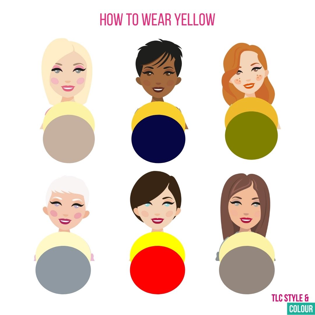
I’ve put together some spring colour combinations for each tonal colour type below:
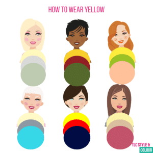
Lights: Match your light and delicate look by wearing similar light and pale shades. Avoid bright or rich colours and high contrasting combinations. If you have a warm undertone as a secondary characteristic, you may find yellow easier to wear.

Deeps: Your look is strong and rich so aim to add depth to your yellows and combinations. Unless in a rich pattern, avoid pale and pastel tones on their own. If you have a cool undertone as a secondary characteristic, yellow will feel harder to wear on its own.

Warms: Many shades of yellow suit you! Combine them with other yellow-based tones for maximum impact.

Cools: Not an easy choice for you so opt for as icy as you can and add cooler tones for contrast.

Clears: Opt for bright, vibrant colours and pair with darker shades or other brights. If you have a warm undertone as a secondary characteristic, you may find yellows much easier to wear.

Softs: As your look is more blended, the same can be said of your colours. Even though it’s not in your swatches, a yellow which looks like it has been faded by the sun will work. Muted tones in combination create a chic look. If you have a cool undertone as a secondary characteristic, yellow will feel harder to wear – try it in a soft pattern.

Ways to wear yellow this spring

If you’re still not quite sure where to start, or you simply can’t find the right version for you this season, here are a few simple ways to bring it into your wardrobe without overthinking it.

If you prefer to watch, I’ve also recorded a 5 minute video on YouTube with four ways to wear yellow – watch it here.

1. Accessories – A scarf, bag, shoes, a hat or a bit of jewellery is such an easy way to introduce yellow without committing to a full outfit. This can be particularly useful if you’re struggling to find a version that works for you.

2. Combinations – Sometimes, the easiest way to break a colour up or change the impact is to pair it with other colours. I’ve shared some combinations for the core tonal colour types above for inspiration. You can also pair it with a neutral like navy, white, greys, browns and denim – it can help to balance the colour and make it feel more wearable.

3. Prints – Opting for yellow in a print or pattern can really soften the overall look to feel less overwhelming. It can be a particularly clever way of breaking the colour up and creating contrast or muted tones.

4. Placement – Where you wear a colour can also be relevant. If yellow near your face feels too much, try it on your bottom half – skirts and trousers can still give you a seasonal lift and be less impactful.

Spring trends (and making them work for you)

There are a variety of yellows in the shops this spring, but not every one will be right for you. Use these tips to make yellow work for you this season and, if you want more specific guidance on the key colours to suit you, explore my Seasonal Updates. I’ve featured seven key colours for each colour type in my Colour Trend Guide (available as part of my Seasonal Updates), which fits inside your colour swatch wallet. Browse the resources here.

With a few small tweaks and a better understanding of what works for your colouring, this season’s trending colours can be an easy way to freshen your wardrobe.

During my Colour Analysis Consultation, your individual characteristics are assessed to establish the shades that suit you best and how to wear them confidently. If you’re unsure what works for you – get clarity by booking a consultation. Gift vouchers are available, or you can come with a friend.

Not sure about your best shades of colour and how to wear them?

How to Find Your Best Red (And Why Some Reds Don’t Suit You)

Most people dismiss red because they wore it once and it didn’t look right. Or they bought a lipstick that didn’t suit them (even though it was supposed to suit everyone…).

There’s no denying that red is a bold colour, but to wear it successfully, you need to stop treating red as one single colour and start thinking about how you can find your red from the wider family of colours.

In my next instalment of my ‘How to Wear Colour’ series, I’ll help you understand why red can feel too much, too warm, or too bright, and how to wear it with ease.
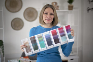

Watch the latest video on YouTube here: https://youtu.be/vHSugg_e2s0

Versions of red

Because there are so many different versions of red, it can feel tricky to find the one that suits you. But, it’s not impossible! Everyone is different, and red has a lot of personality attached to it. That’s why I encourage you to think about red as a family of colours rather than just red.

Rose, berries, tomato, wine and cherry reds are all very different. Each has a different undertone, strength and depth. Your skin responds to them in different ways.

Things to consider:

– Undertone – whether the red is warm (like the colour of a tomato) or cool (like a berry).
– Strength – whether it’s soft and muted, or bright and jewel-like.
– Depth – whether it’s lighter and paler, or deeper and richer – like oxblood.

Your best red will look far more flattering when it echos your own colouring, rather than fighting it.

Tips on wearing red

If head-to-toe red feels too scary or dramatic, tone it down. A splash of red in a pattern, or in your accessories can be just as effective.

It’s a great colour to combine with others if you’re looking to soften it. Classic combinations like navy and red, or paired with chocolate brown and grey are much classier than black in my opinion. A colour clash I really like is red and pink – they might feel daring, but they sit next to each other on the colour wheel!

A bold red lipstick or red nail polish is another easy way to add a pop of colour. Lipstick brings the focus to your face, but I don’t agree that there’s one red lipstick for everyone. I keep a variety of reds in the studio, as well as some great alternatives for when red feels too much.

Pro tip: Red Velvet has a warm undertone and Red Carpet has a cool undertone. Both are available to try in the studio and buy online.

If you’re feeling hesitant, wearing red in a pattern, or adding a pop of red through your accessories is an easy, and less dramatic way to start.

Pro tip: The super soft scarf in Scarlet is a great option of you’ve got stronger or richer features, but it does lean slightly ‘warmer’ as an undertone. Available from the studio as well as online – limited supplies remain.

How I wear red

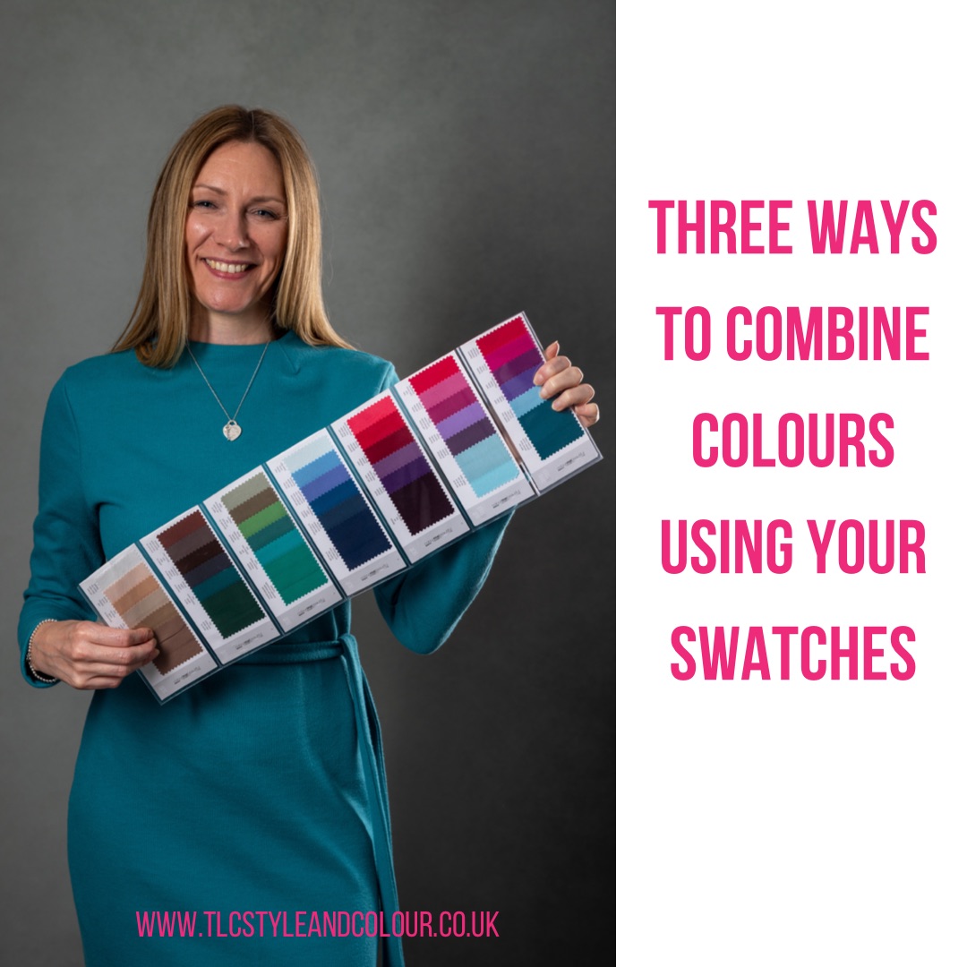
My set of swatches

I have a few red pieces in my wardrobe – dresses, tops and a coat. My reds are more subtle which suit both my colouring type and my personality.

You’ll get a closer look in the video of some of my favourite red pieces, and my red-inspired outfits will be on Instagram and Facebook soon.

I’ll go for a pop of red or opt for my claret and softer shades of red. I tend to avoid very bright and bold versions.

Check the socials (Instagram and Facebook) to see the red-inspired looks and don’t forget to watch the video on YouTube too.

Your best reds

Forget trends and think about how the colour behaves on you.

If red has ever made you look tired, grey, overpowered or uncomfortable, it’s usually because it’s not the right version for you.

A simple way to test this when you’re out shopping is to compare two reds side by side. Hold them near your face and watch what happens to your skin. Does one make your eyes look clearer and your skin fresher? Does the other highlight shadows or redness?

Your best red should lift you, not fight you. And once you find it, red stops feeling bold and scary and starts feeling much more wearable.

During my Colour Analysis Consultation, your individual characteristics are assessed to establish the shades that suit you best and how to wear them confidently. If you’re unsure what works for you – get clarity by booking a consultation. Gift vouchers are available, or you can come with a friend.

Not sure about your best shades of colour and how to wear them?

Find Teal tricky to wear? Here’s how to make it work for you

Teal is surprisingly wearable, yet many people avoid it simply because they’ve never been shown how to wear the right version for them.

So why does teal feel so tricky – and how can you wear it with confidence? In this instalment of my ‘How to Wear Colour’ series, I’ll help you understand where teal sits in colour terms, and show you how to wear it with ease.
Watch the latest video on YouTube here: https://youtu.be/hYRyFJiwOjg

Versions of teal

Teal sits between blue and green on the colour wheel. That’s what makes it so versatile, but also what causes hesitation – is it warm or cool?

A true teal (a blue-green) is actually neither warm nor cool, which is why it tends to work well for so many people.

Some teals lean more blue and feel cooler and crisper. Others lean greener and feel warmer and softer. You’ll also see big differences in depth, from soft and muted teals through to deep, rich versions.

This is why one teal can look fantastic on someone, while another makes them feel washed out or overwhelmed. It’s rarely the colour itself – it’s the version. Go too bold, bright and blue and you’ll verge towards turquoise, which generally isn’t as easy to wear compared to true teal.

Tips on wearing teal

Teal works beautifully with neutrals such as chocolate brown, charcoal grey and navy, but don’t be afraid to go all in either. It’s a calming colour – not overly bright or bold – so for many people it’s easier to wear than expected. It can also work well as an alternative to navy, particularly if navy feels heavy or harsh near your face.

You can also try teal in your makeup, particularly eyeshadow or eyeliner – it’s a subtle way to bring the colour close to your face and brighten your features. Pro tip: Try the Teal Eye Pencil or Smoke or Blue Lagoon eyeshadows – available to try in the studio and online – it’s a fun way to experiment with shades before committing to clothing.

If you’re feeling hesitant, try teal within a pattern, or introduce a pop of teal through accessories such as a scarf. Pro tip: The Olivia scarf in Ocean is a great teal option that suits everyone and is available from the studio as well as online.

How I wear teal

My set of swatches

Teal is one of my favourite colours to wear. Unsurprisingly, it features heavily in my wardrobe – dresses, tops and trousers in a variety of teal shades. If you follow me on social media, you’ll have seen me wearing teal regularly.

You’ll get a closer look in the video of some of my favourite teal pieces, and I’ll also be sharing some teal-inspired outfits on Instagram and Facebook next week.

Teal works well across all seasons, and I love wearing different tones together to create a more blended overall look from soft muted teals to deeper shades from my swatches. I tend to avoid very bright, bold, blue-based shades and stick mainly to mid-depth teals, although I do often dip into my deep teal shade!

Check the socials (Instagram and Facebook) to see the teal-inspired looks next week and don’t forget to watch the video on YouTube too.

Your best teals

If you stick with a true blue-green teal, you won’t go far wrong.

Warmer complexions can usually move slightly towards greener, more yellow-based teals. Cooler colouring often suits bluer-based teals better (sometimes edging closer to turquoise).

If teal feels too strong near your face, wear it lower down in skirts or trousers. Alternatively, try smaller doses within a print to add interest without overwhelm.

Generally, brighter teals suit people with stronger features. So if you’ve tried teal in the past and felt it didn’t work, it’s worth revisiting the shade rather than ruling the colour out completely.

Teal was hotly tipped as a colour to watch for 2026, although Cloud Dancer took the spotlight instead (more on that soon). Teal began appearing in shops during the autumn and winter months, and I featured it in my Colour Trend Guide and Shop the Look guides here. I expect it to continue into spring and summer, so it’s worth keeping an eye on.

During my Colour Analysis Consultation, your individual characteristics are assessed to establish the shades that suit you best and how to wear them confidently. If you’re unsure what works for you – get clarity by booking a consultation. Gift vouchers are available, or you can come with a friend.

Not sure about your best shades of colour and how to wear them?

Struggle With Green? How to Choose the Right Shade

Green can be tricky to wear – with so many shades, it’s easy to pick the wrong one. In this instalment of my ‘How to Wear Colour’ series, I’m showing you how to find the greens that truly suit you.

Watch the latest video on YouTube here: https://youtu.be/7ZX_fZd77tk

Versions of green

Green sits between yellow and blue on the colour wheel, so it can be either warm or cool. The hue depends on the mix of blue and yellow and other characteristics like depth and brightness.

Deep and rich greens like forest, bottle, or fir may not appear to have much warmth or coolness, as depth is the dominant characteristic. Equally, sage or mint are lighter and paler, while emerald green is a much brighter shade.

The key consideration when wearing green depends on your own colouring. Get the right mix that suits you, and you won’t struggle again!

Tips on wearing green

Often associated with renewal or nature, green is seen as a calming colour, and it comes and goes through the seasons. In the UK, it’s often associated with spring, as rolling hills, trees, and flowers bloom. For others, it’s the colour of envy and greed, and it’s often chosen for school uniforms! However you feel about green, it can be a great wardrobe staple or simply used as a pop of colour, like a scarf, top, or accessories.

It pairs beautifully with neutrals like navy, grey, creams, and browns. For anyone who prefers a bolder combo, try it with pink – it creates a real wow effect! And for the festive season, red and green is always a hit.

How I wear green

My set of swatches

Green features well in my wardrobe, particularly in dresses and tops, although less so for the bottom half. You’ll get a peek in the video, and I’ll be sharing some outfits on social media next week.

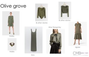
Sage is a great option as it’s more of a greyish-green and perfect for my soft, blended features. I have a jumper dress I pair with jeans or leggings, and my favourite summer dress has a mix of greens in a leaf pattern – something I reach for when warmer weather arrives.

I’m careful not to go too yellow-based with my greens, as I have a cooler skin tone. Too warm shades, like olive, moss, or khaki, can make my skin look sallow. My greens therefore tend towards teal and turquoise, which I’ll cover in a future episode as I have plenty to show.

Check the socials (Instagram and Facebook) to see the green-inspired looks next week and don’t forget to watch the video on YouTube too.

Your best greens

Warmer complexions suit yellow-based tones, which are more common in the shops – olive, chartreuse, lime, and khaki. If these make your skin look dull or sallow, they’re likely too warm for you; wear them away from your face, or in small amounts within a pattern to minimise the impact.

Cooler greens are harder to find and often have more blue or grey tones, making them better suited to cooler skin tones.

Generally, lighter greens flatter fairer colouring, while brighter shades tend to suit those with stronger features.

The key consideration is finding the right version for you – how would you describe the colour, and what impact does it have against your skin tone? Get this right, and you won’t struggle again!

During my Colour Analysis Consultation, your characteristics are assessed to establish the right shades and how to wear them. If you’re not sure what suits you – get clarity by booking a consultation. Gift vouchers are available, or you can come with a friend.

Not sure about your best shades of colour and how to wear them?

Think brown is dull? Here’s how to wear it

Brown is having a real fashion moment this season, and in my opinion, it’s even more chic than black.

It offers the sophistication often associated with black but with so much more elegance. It’s the perfect alternative for those who prefer richer, earthier tones—and it doesn’t have to feel dull or be reserved for accessories!

Continuing my mission to inspire your wardrobe, brown is my focus in the latest instalment of the ‘How to Wear Colour’ series.

Watch the latest video on YouTube here: https://youtu.be/o9oEvwQpD8E

Versions of brown

Like beige (covered in September), brown comes in many shades, so there’s usually one to suit you. It’s softer than black, making it a great alternative for most people.

Many tones, like chocolate and coffee, lean warm with a yellow undertone. If you need a cooler brown, pewter or mushroom shades contain more grey and are more flattering for cooler skin tones.

Tips on wearing brown

Brown is surprisingly versatile, especially if you usually reach for black or navy. A jumper, skirt, or tailored trousers can act as a neutral base for your outfit—plenty of options this autumn!

It pairs beautifully with other neutrals like creams and beiges, but also works with colour. Try lavender, sky blue, pinks, sage, or apricot. For bolder choices, teal, aqua, and red are equally as good.

Hair colour: Broadly speaking, the darker your hair, the easier it is to wear brown as a stand-alone colour. If you’re finding that it washes you out, pair it with another colour to lift it.

Mix textures: Pair a chunky brown knit with smooth leather boots or trousers. Combining your fabrics can make your outfit look more modern and interesting.

Placement: If it feels draining when worn close to your face, opt for it on your bottom half.

How I wear brown

My set of swatches

Brown isn’t a colour I have much of in my wardrobe, as it feels heavy to me. Until now, it was mainly reserved for boots!

Chocolate brown and rose brown suit me well, but noticing a gap, and inspired by this season’s looks, I picked up a more wearable pewter brown jumper and a rose brown top this season. The jumper has quickly become a go-to casual piece, worn simply with denim or burgundy leggings as the weather starts to cool.

Check the socials (Instagram and Facebook) to see the brown-inspired looks next week and don’t forget to watch the video on YouTube too.

Your best browns

Warmer complexions suit more yellow based, camel and coffee-like tones, whilst cooler tones are best with grey and taupe toned shades like pewter. If you struggle to wear browns in your makeup, it’s worth checking your colouring type.

Your personality and style matter – they go hand in hand. Pair brown with colours you love, compare to your swatches, and pick shades that make your complexion glow.

Brown may seem basic, but worn with the right shades, it can play a stylish part of your wardrobe.

Looking for this season’s perfect browns and other on-trend shades? Explore my full autumn winter 2025 Seasonal Updates here for colour inspiration and shopping guides.

The key to finding the right brown for you — and wearing it with confidence — is to discover your best colours.

During my Colour Analysis Consultation, your characteristics are assessed to establish the right shades and how to wear them. If you’re not sure what suits you – get clarity by booking a consultation. Gift vouchers are available, or you can come with a friend.

Not sure about your best shades of colour and how to wear them?

Burgundy: A seasonal favourite and how to wear it

Burgundy is a rich, timeless shade that’s been a favourite for a few years and one I personally love wearing.

There’s something about this colour that feels perfectly at home in autumn. It’s elegant, versatile and adds a touch of warmth to any outfit.
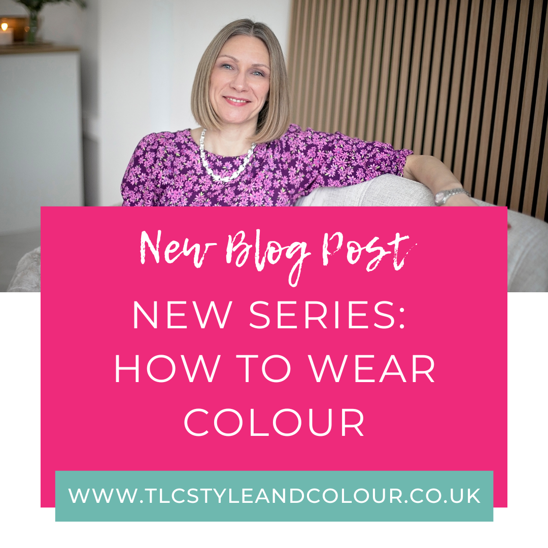
Continuing my mission to help inspire you with your own wardrobe, burgundy is my next focus in the ‘How to Wear Colour’ series.

Watch the latest video on YouTube here: https://youtu.be/KcnxJ-wejCw

Versions of burgundy

Like many colours, it comes in more than one shade – think winter berries and wine-like colours to get an idea of the different shades and tones available.

Tips on wearing burgundy

Traditionally speaking, burgundy sits in the medium-to-deep range of colours, which means that if you have a lighter-looking appearance, it can sometimes feel a little overpowering.

Consider wearing it on your bottom half (and away from your face), or tweak the tone, so it doesn’t have the level of depth that traditional burgundy tones have such as a richer cassis or claret.

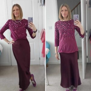
Fabric such as satin or silk will add lightness and brightness, whereas heavier textures like wool or cord can deepen it and add some softness through the texture.

Burgundy works beautifully with neutrals like cream, greys and browns. Or, if you prefer a little more colour, opt for a lift with pinks, reds, blues or oranges. They work surprisingly well!

Patterns are also a good way of breaking up the block of colour too if you’re finding it a but too much.

How I wear burgundy

My set of swatches

For me, damson is my best version of burgundy and works perfectly with other colours in my wardrobe. I’m sure you’ve seen me in my satin skirt, but I have many other garments from clothes to accessories!

Within my swatches and in this berry and wine-like colours is also claret. I love pairing both with pink (the ‘colour covered in August’s episode) for a fresh and vibrant look and they both work well with nude-like colours too (I use shell).

Check the socials (Instagram and Facebook) to see the burgundy tones in my wardrobe next week and don’t forget to watch the video on YouTube.

Your best burgundy

When adding burgundy to your wardrobe, look for pieces that you’ll wear often and that combine easily with colours you already love. It’s an easy shade to reintroduce each autumn, so consider knitwear, skirts, jeans, scarves, bags or boots. Plenty again this season.

Do you need the depth that a traditionally-looking burgundy tone has, or do you need to lighten it up? Perhaps you need more warmth, or even more cool-ness?

Makeup can be a really clever way of adding a pop of burgundy too – from lipsticks, to eyeshadows and nails!

The key to finding the right burgundy for you — and wearing it with confidence — is to discover your best colours.

During my Colour Analysis Consultation, your characteristics are assessed to establish the right shades and how to wear them. If you’re not sure what suits you – get clarity by booking a consultation. Gift vouchers are available, or you can come with a friend.

Not sure about your best shades of colour and how to wear them?

Feel beige is boring? Here’s how to wear it

Beige often gets a bad reputation for being dull, plain or boring – something which I’ve felt myself on occasions. But it doesn’t have to be!

The way you wear it makes all the difference. Beige can be timeless, chic, and incredibly versatile when you choose the right shade for your colouring type and style it in a modern way.

Continuing my mission to help inspire you with your own wardrobe, beige is my next focus in the ‘How to Wear Colour’ series.

Watch the latest video on YouTube here: https://youtu.be/qfnbppj-Iqc

Versions of beige

Beige isn’t just one colour. I like to think of it as a family of colours.

A much lighter version of brown and more subtle in their tone and depth – stone, oatmeal, taupe, pewter, mushroom, mole and cocoa – Pantone’s Mocha Mousse equivalent. Think of coffee-like colours – latte, cappuccino or linen-like colours.

Tips on wearing beige

There’s no denying that it’s a more classic shade. Whilst some fear being part of the ‘beige brigade’, others love the simplicity and timelessness of it.

Most people will have a version of beige that suits them — just check your swatches. The key is how you wear it:

Hair colour: Fair-haired people often find beige easier to wear as a stand-alone colour. If you have darker hair or stronger features, it can wash you out unless you pair it with another colour.

Colour-combos: Lift beige with something other than a neutral — try reds, pinks, greens or purples.

Fabric: Fabric choice matters. A shiny silk or satin blouse reflects light, making the colour appear brighter, while a matte finish looks more subtle.

Placement: If beige close to your face feels draining, choose it for trousers, skirts or shoes. Or, opt for beige in a pattern to break up the block of colour.

How I wear beige

My set of swatches

I have a family of beiges within my swatches which are all much lighter versions of brown and more subtle tones. They’re subtle tones and not too strong which is why they suit me well.

However, I have very few items in my wardrobe, as I prefer to wear colour. That being said, the items I have are more investment or core items which tend to be outerwear. I’ve got a gorgeous checked wool coat, long wool dress and gilet in the stone and taupe colours from my swatches.

Because they’re neutral, they work seamlessly with the other colours in my wardrobe without clashing. The wool coat is a great example, featuring several of my beiges, and I’ve shared it in the video and on social media.

Check the socials (Instagram and Facebook) to see the beiges in my wardrobe next week and don’t forget to watch the video on YouTube too.

Your best beiges

Warmer complexions will suit more yellow based, camel-like tones, whilst those who are cooler are best with grey and taupe toned shades.

Your personality also plays a part — for the same reason I’ll rarely wear beige from head to toe. If you’ve got beige items sitting unworn, check whether the undertone is right for you. Or, try pairing it with a colour you love, like red, pink, green or purple.

The key to finding the right beige for you — and wearing it with confidence — is to discover your best colours.

During my Colour Analysis Consultation, your characteristics are assessed to establish the right shades and how to wear them. If you’re not sure what suits you – get clarity by booking a consultation. Gift vouchers are available, or you can come with a friend.

Not sure about your best shades of colour and how to wear them?

Feel too ‘girly’ in pink? Here’s how to wear it with style

Is pink a colour you tend to avoid? Perhaps it feels too feminine, too sweet, or just not for you?

Time to rethink pink as I share some tips in this month’s ‘How to Wear Colour’ series. (Revisit last month’s here)

Watch the latest video on YouTube here: https://youtu.be/1_06ChgHkiQ

Pink isn’t just for princesses…it can be grown-up too.

Versions of pink

There are so many versions of pink – it’s not all pastels or Barbie hues – there really is a pink for everyone! It’s simply a case of finding the right pinks that suit your natural features. And your personal style of course.

Pink is made from the colour red mixed with white (which was last month’s colour) in order to lighten the colour. Pastel pinks, dusty pinks right through to bright fuchsias and berry-like tones.

Another characteristic to take note of is whether the shade has a warmer or cooler hue. Whilst not always easy to spot, warmer hues have a yellow base to them and make them more coral or peachy looking.Cool tones are more blue-based and most typical of many berry-like pinks.

Tips on wearing pink

Along with the hue I mentioned, another feature to consider when choosing to wear pink is the depth of the colour. The brightness of the colour matters too – compare a dusty pink to a hot pink and you’ll see what I mean. Bolder colours may feel less ‘girly’, but they may overpower your features if it’s not quite the right shade for you.

You’ll often find pink tones featured in prints and patterns which may be your preferred way to wear it. And, don’t forget your accessories as they are such an easy way to wear pink (and one of five I mentioned in last week’s blog. Revisit it here).

How I wear pink

My set of swatches

Within my swatches, there is a range of pinks which suit me. Plus, I have a variety of  pinks in my wardrobe too from more subtle tones, to brighter berry tones. Nothing very pale or very bright as they are too much for me.

I’m happy to opt for a pop of pink by wearing my tweed blazer, but I’ll also wear patterns in dresses and some tops.

Don’t forget to check the socials (Instagram and Facebook) to see how I wear the pinks in my wardrobe next week. The jacket and jumper are both featured in the video on YouTube too.

Your best pinks

Personality certainly comes into play more with your choice of pink than some other colours, but that doesn’t mean you need to avoid it!

If you have pink in your wardrobe which you’re not wearing, perhaps it’s the shade that’s not working for you. Is it too strong or too pale? Try and wear it with another colour to see if that helps.

Your best shade of pink may have a warmer tone to it, or be blue and cool based instead. Knowing the right hue for you will stop you buying the wrong makeup shades!

The key to finding the right pink for you and wearing it with confidence is to discover your best colours.

During my Colour Analysis Consultation, your characteristics are assessed to establish the right shades and how to wear them. If you’re not sure what suits you – get clarity by booking a consultation. Gift vouchers are available, or you can come with a friend.

Not sure about your best shades of colour and how to wear them?

5 effortless ways to wear colour

If you naturally gravitate toward neutrals, or feel unsure about how to bring colour into your wardrobe, this one’s for you.

Wearing colour doesn’t need to feel bold or intimidating. In fact, it can be easy, enjoyable, and totally “you” — when you know how. Here are five effortless ways to wear colour with confidence.

Start small

Dip your toe in by adding colour through your accessories. Think handbags, shoes, or statement jewellery in a flattering shade. It’s an easy way to bring colour into your outfit without feeling like you’re trying too hard. A little goes a long way!

Choose colour near your face

If you’re ready to take it a step further, try coloured tops, cardigans, or scarves that sit close to your face. The right colours worn here can instantly brighten your features and make your eyes sparkle — minimal effort required

Not sure which colours flatter you best? Revisit my blog on the Nine tell-tale signs that you’re wearing the wrong colour)

Pair with neutrals

If colour feels too loud, tone it down by pairing it with one of your neutral basics so it feels a bit ‘safer’. And by neutral, I don’t just mean black (which, for many people, isn’t actually that flattering). Think greys, navy, soft whites, browns — anything that complements your palette. It creates a balanced, effortless look and is easy to pull off.

Stick to harmony

Colour only feels overwhelming when it isn’t the right one for you. Sticking to your colour palette — the shades that work with your skin tone, hair, and eye colours — will help everything feel more natural and polished.

For example, I wear mid-depth colours that suit my features and aren’t too bright or highly contrasting. That way, I still feel like me, not like I’m being drowned out by what I’m wearing.

Try prints

Still feeling unsure? A print that includes your best colours (even mixed with others) often feels much less intimidating than a solid block of colour. Look for patterns that include your favourite shades — maybe a go-to neutral or something that suits your personality. You’ll find it far easier to wear and feel more confident in your choice.

Ready to feel more confident in colour?

Discover your colours with my colour analysis consultations. They’ll help you understand the shades that work in harmony with your natural features — and give you the confidence to wear them every day.

Find out more here: Colour Analysis Consultations

Ready to get started?

Feeling washed-out in white? Here’s how to wear it

To help inspire you with your own wardrobe, I’ve launched a new ‘How to Wear Colour’ series, in which I’m sharing how I wear my colours.

If you’ve struggled to wear white without looking washed out, or you’re a Wimbledon fan, this one is for you!

The first episode of the series is available now – watch it here: https://youtu.be/FRWq4GqB7UI
Whether you love to wear colour, or you’re simply looking for some outfit inspiration, you’ll find tips from me to give you confidence in your colour choices. After all – everyone really can wear every colour, but getting the right shade which compliments your features and brightens your skin tone is the difference between looking like you need a blood transfusion, and looking fabulous!

Versions of white

White can look so simple, clean and elegant, but can be surprisingly tricky to get right!

July often means the start of the summer holidays for many, so it’s a great time to start with white. But, if you’re honest, you may only feel you look good in white when you have some glow to your features. After all, who doesn’t reach for white in the summer to show off their tan??

White has no other colour mixed in with it and it has no depth at all. It’s the lightest colour according to the Munsell colour theory and scale. Because it’s the lightest colour, it also reflects rather than absorbs any light, making it the lightest shade you can wear. For this reason, when it comes to wearing white, the purest of the whites will not suit everyone’s characteristics the same.

The best version of white for me is a softer white. It’s less harsh, pure or stark, especially when I’m wearing it close to my face. As very few people can successfully wear a bright white, a soft white, or off-white shade can be much more flattering.

Tips on wearing white

One of my tricks is to wear white in a pattern — it breaks up the colour and will often appear to soften the overall impact. This can be particularly helpful if the shade isn’t your most flattering version. Combining colours together, whether in a pattern or with garments in a colour-blocking way, can be a clever trick to appear more flattering.

Opting for accessories like a pair of white sandals or a bag can be a much easier way to wear white. Don’t be afraid to experiment with your accessories – they can be more forgiving with colour!

Consider the fabric – shiny fabrics like satin and silk will reflect the light and make the white appear brighter. Matte fabrics such as linen or cotton will absorb the light reducing the brightness of the colour.

Remember that your most flattering version of white could be a softer shade like mine. Those with a more golden skin tone, may find that cream is easier to wear. A brighter white may suit you better if you have high contrast or definition between your features.

How I wear white

My set of swatches

As I mentioned, my best shade of white is a softer white. I rarely wear all-white because I feel more washed-out with my paler skin tone. I gave up on white jeans and trousers many years ago – I’m just too clumsy and they don’t stay white for long!

Head on over to socials (Instagram and Facebook) to see how I wear the whites in my wardrobe and don’t forget to watch the video on YouTube: https://youtu.be/FRWq4GqB7UI.

Your best whites

Do you know your best shade of white and how to wear it?

Take a look at the whites inside your wardrobe – are you wearing them? Feeling that they look a bit ‘off’ is often a good indicator that it isn’t quite right for you. Combining it with another colour could help, but if you can’t make it work, it may not be your best shade of white.

Your physical features (hair colour, eye colour and skin tone) are assessed in my Colour Analysis Consultations to find your most flattering shades and how to wear them confidently in your clothes, makeup and accessories. So, if you’re not sure – get clarity by booking your session.

Not sure about your best shades of colour and how to wear them?

New series: How to wear colour

I’m excited to share something new with you — a fresh new series of ‘How to Wear Colour’ videos on my YouTube channel.

Each month, I’ll tackle a new colour to show you:

– My version of that colour

– How I wear it myself with examples from my wardrobe

– Tips for wearing the colour so you don’t feel washed out, dull, or overwhelmed

The aim? To help you wear colour with more confidence! I’m sharing how I wear my colours to inspire you with your own wardrobe so you can get the most out of what you already own.

Where to watch

Visit my YouTube Channel:

https://www.youtube.com/@tlcstyleandcolour

The first video will be live from Monday 14 July. I’ll be showing you how to wear white without looking washed out!


The second video will go live on 11 August, why not subscribe whilst you’re there so you’ll get alerts when all videos go live?!

You’ll find all episodes in the video series on this playlist on YouTube.

Outfits

I’ll also be sharing snippets of the videos and some outfits I’ve been featuring over on Instagram and Facebook.

Instagram: https://www.instagram.com/tlcstyleandcolour/

Facebook: https://www.facebook.com/TLCStyleandColour/

Remember to give a follow, comment and do share with your friends who love colour as much as you do!

Prefer to read?

There’ll be a blog to accompany each video for each colour here on the TLC Style & Colour blog, so you can pick up extra tips too.

Do let me know if you have a colour that you’d love me to cover how to wear it and I’ll try and feature it for you next time!


Not sure about your best shades of colour and how to wear them?


How to wear the latest trending colour: Burgundy

I’m sure you’ve noticed that the colour burgundy is having a real moment right now.

If you’ve got a much lighter look to your appearance, you would rightly be wary about it, because it sits in the medium to deep range of colours. This means that it can often be too strong a shade for you to wear successfully, without looking too washed-out.

Last week, I talked about the colour traps people fall into – buying things just because it’s in the shops. But, it really is worth remembering that if it’s not YOUR best colour, or it doesn’t suit your style or it doesn’t suit your shape, it could be a purchase you later regret.

There’s more than one version of a colour

Think winter berries and wines and you’ll have an idea of the different shades and tones you’re likely to find.

Fabric can appear to alter the appearance of a colour too (consider a satin blouse versus a fine knit jumper), and you’ll realise you can make better shopping decisions.

With my recent seasonal update for clients, I showcased a range of colours they could expect to find this season for their colouring type. I’ve already done the hard work, so I know there’s other colours you’ll find! Sometimes, you have to dig a little deeper to get the right ones for you.

When adding this (or any) colour to your wardrobe, consider if it works with what you already own. After all, there’s no point buying something for the sake of it! I’ve got lots of claret and damson already in my wardrobe to choose from without needing to buy anything specific this season just because it’s a ‘trending’ colour! Being able to make more informed decisions means that you’ll make better choices and keep things longer because you know they’ll suit you and work with what you already have.

Once you’ve had a Colour Analysis Consultation, it’s easy for you to know the shades which are right for you simply by checking your swatches!

If you haven’t had a colour analysis, you’ll need to select wisely or the colour could wash you out.

Five ways to wear ‘burgundy’

  1. Check what the impact of the colour is against your features – is it casting a shadow, or making you look tired?
  2. Keep the colour away from your face if you’re not certain – skirts, trousers, jeans and boots work just as well and still give a nod to the trend.
  3. Opt for the colour in a print as this can be more forgiving (especially if it’s mixed with colours which do flatter your features)
  4. Go for accessories – there’s lots to choose form this season from footwear to bags.
  5. It’s also a great option for makeup – think eyeshadows, lipstick and nails!

burgundy shades of colour me beautiful makeup


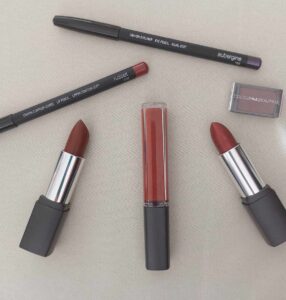
On the latter point, in this image there is a selection of makeup shades which I’ve picked out in this colour grouping.

They’re all available from the studio as well as online and have been produced for Colour me Beautiful to suit your colouring type.

The items featured are:

Damson eyeshadow, aubergine eye pencil, russet lip pencil, sheer nutmeg lipstick, sunset lipgloss and mahogany lipstick. They won’t all suit you the same of course (because it’s the same ‘rules’ for your makeup colours as it is for your clothes). Do ask if you need any advice.

You can browse online here: https://colourmebeautifuldirect.co.uk?aid=C564 (Affiliate link)


With all colours, it’s about understanding your own look and how to wear colour in the most flattering way. That’s one of the benefits to having a colour analysis!

Let me assure you that I’m not the colour police….or some crazy 1980s-wacky-colour-combo-kind-of-gal. But I will show you the impact of colour and how to wear the shades which suit you during a consultation.

Find out more here: https://www.tlcstyleandcolour.co.uk/services/colour-analysis-consultations/

Ready to get started on your colour journey? Book your appointment now!

Gift vouchers are also available!

Why does wearing the right colour matter so much?

I never get bored of talking about colour!

The energy that colour brings into our lives plus the endless ways of wearing colour is the reason that my colour analysis consultations are so popular.

Why does colour matter?

When you wear colour near your face, the light reflects it upwards. This can either cast a flattering tone, or dark shadows, depending on the mix of the colour and your features (ie. your skin, eye and hair colour).

Wearing colours which are right for you, your skin will look radiant and your eyes will appear brighter. But, when you wear colours that aren’t as flattering, they’ll cast shadows across your face, making you look tired and unwell.

I’ll show you the colours that look amazing on you so that you can look and feel good every day, with my colour analysis consultations.

It’s been well over 10 years since I trained with Colour Me Beautiful. Using a more modern system based on Albert Munsell’s findings; the tonal system offers a more flexible way of analysing colour, compared to the traditional seasonal approach which first entered the UK in the 80s. (I’ve talked about the differences previously here)

The beauty of the Munsell system is that it can be used to describe a person’s physical features as well as colours generally. Under the tonal system and during a colour analysis consultation, I’ll assess the three properties of colours – undertone, depth and clarity of your features.

Making confident choices

You’ll learn ‘how to wear’ colour, rather than being prescriptive by restricting your colours. I’ll provide you with a whole host of tips and tricks during and after your appointment to ensure that you feel confident to pull it all together.

Wearing colour influences those around us, because different colours can affect people’s moods, perceptions, and reactions. Bright, vibrant colours might make you seem more approachable and energetic, whilst deeper colours can give off a more serious or professional vibe. Colours can also evoke certain emotions or associations, eg. red for passion and blue for calmness. So, the colours you wear can change how others see and respond to you.

When you understand how colour works, it will bring you immense joy! You’ll feel much more confident dressing and shopping for new (or pre-loved) clothes, as well as fabric, if you make your own. The boost to your confidence is hard to ignore. And, I never tire of hearing it from my clients!!

There are guidelines to follow which I’ll explain during your consultation, but rest assured, I’ll inspire you further with combinations and tips on wearing your new colours too. Plus, you’ll take away a set of fabric swatches to guide you further too.

Neutral colours

Your swatches will contain a number of fabric squares in the colours which flatter your features. Most people are familiar with black and navy. But, alongside these there are other shades such as browns, greys, whites and even some greens. These will have a little ‘n’ marked next to the name of them to guide you further.

For some people, these will be represented by the core items in their wardrobe, like jackets, coats, knitwear and bottoms. For others, they could be accessories like shoes, boots and bags.

It is simple to put together outfits when you understand your best colours and how to wear them. There’s plenty of neutral recommendations to show you during your colour consultation. You’ll leave brimming with ideas on how to wear clothes that you already own, so that you can start to build your own versatile or capsule wardrobe.

Fashion and accent colours

Of course, life would be boring if we all wore neutral shades! During a consultation, I’ll introduce you to your best reds, greens, blues and more!

If you invest in neutrals as core items, you’re then likely to wear one of your many colours next to your face. This is where selecting your most flattering shades can really take off. Everyone can wear every colour, but not every shade of colour will flatter you the same. If you saw my blog a couple of weeks ago about wearing pink, you’ll see that it’s merely the shade of colour which differs and what you wear it with, depending upon your colouring type.

Remember, just because your friend looks great in something, doesn’t mean that you will too! So, if it’s not as good on you, it’s simply about learning how to adjust the colour to make it work better for you. Don’t worry, it’s all explained during your colour analysis consultation.

Makeup and accessories

Accessories can often be an easy way to add a pop of colour to any outfit. Opt for a simple scarf, hat or gloves! But, if you’re a jewellery lover, simply add colour this way instead (read 6 reasons why a necklace is more than just an accessory). You’ll also learn your best metallic (gold or silver) during a complete colour analysis consultation.

Moving on to makeup – what you wear on your face matters just as much as the colours you wear on your body.

For example, a rose pink blusher will look harsh on someone with a warm skin tone. During my Complete colour analysis consultation, I’ll show you your best makeup shades. There’s an opportunity to try and buy cosmetics from the Colour Me Beautiful range if you don’t have a specific shade at home. You can browse the full range, and filter by your colouring type here, and all cosmetics are available to try before you buy at the studio.

Find out more about my Colour Analysis Consultations

Find out more

How to find clothes that are the right fit for you

If you find it a challenge getting clothes to fit you, it’s tempting to blame yourself. Often, it’s that they aren’t quite right for YOU.

Unless you make your own clothes, or have them made specifically for your body, there might be certain aspects of a garment that don’t quite work. Rest assured, there’s tips and tricks to ‘correct’ many elements, it’s simply understanding and learning what to look for.

This quote sums it up perfectly for me:

The dress must follow the body of the woman, not the body following the shape of the dress. (Hubert de Givenchy)

Identify what’s right for you and work with your body shape, not against it. So, if you’ve got a curvy figure then a boxy shape to a garment will add pounds to your frame because it hides your frame and shape. Nobody wants that!

I meet a lot of ladies who feel that things don’t work for them and they dislike shopping as a result. This is totally understandable, especially if you don’t know what to look for. What’s more, you’ll spend lot of time and money trying to find out.

Right colour, right style, right fit and lifestyle-appropriate. Nail these, and you’ll be grinning like the cat that got the cream. Let me go through these in more detail.

Colour

Have you ever put something on and noticed that the colour drains from your face? Or that suddenly your skin has gone a funny colour?

That need to add a brighter lipstick or slap more blusher on, is because the colour you’re wearing isn’t quite right for you.

The transformation to your overall appearance when you’re wearing the right colours for you, cannot be ignored! It’s a subject I cover frequently here on the blogs as well as on social media.

Colour analysis consultations are by far my most popular service and I never tire of seeing the transformation with clients. I work with a tonal colour analysis system, which assess the colour of your hair, eyes and skin tone to determine the three elements of your colouring type and colours which flatter you the most. My colouring type is soft, cool and deep which means that my core colouring type is soft (low clarity to my features overall, muted and mid-tone colours), with a cool undertone to my skin (blue toned shades rather than yellow) and with some depth (my tertiary as the light pale colours really do wash me out).

Wearing the right colour will visibly lift your appearance but unless it fits like a glove (or vice versa), it will never be perfect for you, so you’ll need to factor these next elements in as well.

Style

Your style is really what feels most like you. Sometimes, it can be hard to describe what your style is, or you may feel like you don’t have one! But, I can assure you that everyone does. Just think – what feels most like you when you wear it?

When you put something on that doesn’t feel like you, you’ll immediately protest as much and take it off! But, wear something which you feel happy, comfortable and more like you when you wear it, and you’ll be much happier. No point dressing like Paloma Faith if you’re really more a Jennifer Aniston type.

That doesn’t mean that you can’t dress differently, or try something new. Try to push your style boundaries, but in a way that feels authentic and still like you. Sometimes it can be the choice of fabric, but more on that shortly.

Patterns can be a real deal-breaker in the style department. For me, I’m not a fan of fussy patterns or stripes. They just don’t work for my style personality, so I don’t tend to buy them as I know I won’t get my £’s per wear or be happy in them.

Fit

We all know when something doesn’t fit right, but often associate this with the number on the label. It’s more likely not fitting your body shape, body line and proportions. Understanding these aspects will help you identify the right style, fit and fabric to choose. Let’s say that you’re petite in height, with a long upper body and short legs – of course it will be harder to get the right fit! But, understand how to dress your features and you’ll make better choices with styles and cuts.

Don’t forget the finer details like sleeves and necklines. A high neckline when you’ve a large bust will enhance the area. You’ll find a lower neckline (like a v-neck), will break up the colour and be more flattering. Sleeve lengths and shoulder seams can be corrective; like a ruffle sleeve when you’ve got small and narrow shoulders. On the other hand, they can enhance the area if you’re broader with wider shoulders by merely extending the shoulder line out, visually speaking.



Most people who come to me for a style and shape session don’t consider the fabric of a garment. Yet, it plays a crucial role in the fit of a garment. Different fabrics have different weights and feels, not to mention how it drapes. Whilst both light in weight, cotton and jersey have a different feel and structure to them. The same garment made from both will look and feel different when worn, depending upon the body wearing it.

In this example, the cotton top left loose over a satin skirt hides my underlying shape and proportions. A few tweaks and hey presto! Learn much more during a 2.5 hour style and shape consultation.

These are just tweaks. Tailoring can be a game-changer in achieving the perfect fit and I often recommend clients have a good seamstress on hand, if they need one. Transformed into bespoke pieces that fit YOU and make them a perfect fit! Which is a huge benefit when you do make your own clothes, because you can create the garment to take into account your own body measurements and adjust the pattern accordingly.

Not knowing what fits and flatters you means you can still end up making costly mistakes so it pays to understand these elements of your body.

Lifestyle-appropriate

Being able to tick all boxes with your clothes, or altering them accordingly, will make it so much easier to dress in clothes that make you look and feel good.

I’m a big believer in having clothes which work for how you spend your time. If you’re the outdoorsy-type and love nothing more, those knee-high, stiletto, velvet boots aren’t going to fare very well…

When your clothes suit the occasion you’re dressing for, you’ll feel appropriate and comfortable, especially when you know they tick all the boxes: right colour, right style, right fit and lifestyle-appropriate.

Get to know what works for you!

Gaining the knowledge can take time if you’re not sure what to look for and it can be costly if you keep making mistakes. My consultations are designed to guide you so that you understand what works for you, and why.

Discover the colours which enhance your natural features and how to wear your colours during a Colour Analysis Consultation. During a Style & Shape session, you’ll learn how to find clothes that tick all the boxes for you as we identify your style personality, shape and proportions.

Get in touch to book your session with me now!

The impact of hair colour in colour analysis consultations

Your hair, and specifically the colour of it, is often a huge topic of discussion during my colour analysis consultations!

I believe it plays an important part of your overall appearance, which is why I assess it during your colour analysis.

Over the years, I’ve seen many clients and heard lots of stories of how hair colour changes have an impact on what you wear. Whether it’s a choice of colouring your hair, ageing, or medical reasons like hair loss and cancer. They all have an impact.

Once you begin to notice that certain colours don’t look quite as good as they did, it’s worth determining if the reason is due to hair changes. If so, how permanent is it likely to be? You may be able to ‘weather the storm’ so to speak!

Skin tone

Worthy of note is that there’s a common misconception that the undertone of your skin doesn’t change as your age. Certainly, under the seasonal colour analysis system, you remain the same palette. However, I’ve seen plenty of examples where this isn’t the case.

The Colour Me Beautiful tonal colour analysis system which I use in my consultations, is more flexible as it recognises that as we get older, hair loses pigmentation, eyes become more muted, and skin becomes more transparent. These aspects will affect the impact of colour when you wear it.

The Colour Me Beautiful MD; Cliff Bashforth is a great example of this. Over the years, he has transitioned between palettes. Back in the early years of colour analysis, Cliff was an autumn. As the seasonal system was developed with CMB, he was a soft autumn Certainly, under the seasonal system, he would still be classified as someone with a warm skin tone, which he actually isn’t anymore. His overall features have changed.

Going grey

Along with Cliff, I have seen many clients over the years who have decided to embrace the grey! Revisit this blog here and take a look at Carol.

By way of another example, if you had dark brown hair in your younger years you’re likely to find that stronger, richer or bolder colours are now feeling and looking ‘too much’. They may be overwhelming your more delicate or softer appearance because the harmony between your hair, skin and eyes has changed.

Not all greys are the same either. There are ash tones, whites, silvers and salt and pepper. But, a colour analysis consultation can help to determine your best shades of colour and how to wear them.

Colouring your hair

Let’s say you were mousey and now have a more vibrant and striking red colour to your hair. The muted colours you will have looked amazing in previously are unlikely to have enough ‘bite’ or drama for you now. No doubt that if you’d been analysed previously, you’re likely to have stopped using your swatches some time ago! The key now is to match the intensity level of your hair with the colours you wear. Do be aware that red tones in the hair can be bold and bright or red and auburn and this difference can have an impact on the underlying hue of the colours which suit you best.

Medical reasons

This can be a very sensitive topic for people. Having worked with some cancer patients over the years, a result can often be hair loss. Many find that their hair grows back very differently! Resulting in a change to your appearance and therefore the colours which once loved you, might not love you the same now.

Deciding to embrace the no-hair look can be a brave move and I remember a client who had alopecia with the most remarkable pattern and design tattooed to her head for the summer. She found the heat was too unpleasant to wear her hair pieces.

Equally, hair pieces can transform your overall look in the same way. Choosing to go blonde, brunette, red or blue will all require an adaption if you want what you wear to harmonise with your features.

Wardrobe impact

If you have found that your hair colour changes are having an impact on your choice of colours and how they look, a wardrobe assessment might be in order.

Should the change be temporary, or you plan on frequently changing your hair colour, you may find yourself altering and updating your wardrobe frequently.

A more permanent change means it’s a good time to reassess your wardrobe and if what you have still works for you, or if you need to adapt it.

Be certain that it’s definitely the colour that’s not working for you, or if it could be the pattern/design/style/fit or material? These factors can also affect how ‘good’ something looks and how you feel.

Can you ‘rescue’ the colour by wearing it with another colour? Perhaps try a scarf or jewellery to break up the colour near to your face.

A piece of advice I give all my clients is to keep the ‘wrong’ colour away from your face and wear it on the bottom half. The impact of the colour will be far less severe when worn this way and you still get to wear and enjoy it.

Dyeing your clothes could be another option, especially if the fabric is not man-made. Synthetics don’t dye well at home (without major effort), but mixes still will (like polycotton).

For those that can’t be rescued and you decide to let them go, be clear about what colour you need to replace it with, if at all.

The impact of different shades of a colour

I always say that you can wear every colour. However, there is more than one shade, tint or tone of a colour!

I’ve recorded a video in which I show you examples of different tones of pink and greens against my features. I wanted to try and demonstrate the subtle difference in colours and how they would look different if my hair was different. You’ll find it on YouTube here.

A colour analysis consultation will help you with all the aspects discussed in this blog and shown in the video.

Get in touch to book your colour analysis consultation.

Appointments are available Monday to Saturday. To enquire about availability, just get in touch! Toni.carver@tlcstyleandcolour.co.uk

4 Colour analysis mistakes, what to look for and how to get it right

In last week’s blog, I shared nine tell-tale signs that you’re wearing the wrong colour which you can revisit here.

As a professional colour consultant, I’m always asked how to tell if the colour you’re wearing is right for you. This is an important one, given that one of the (many) advantages of getting your colours done is to be able to know and understand what suits you so that you can make fewer shopping mistakes. But, it can also be very subjective and up for ‘opinion’ because not everyone sees colour in the same way.

Yet, your image makes up a very visual statement to the world. If something doesn’t suit, fit or flatter you, or you don’t feel good in it, this will be seen and reflected in your image. Your style and shape have an important part to play in your overall image but it’s colour which has the most impact. When a colour isn’t right for you, it will alter and impact your appearance greatly.

I’ve recorded a video which takes you through some of the common mistakes people make when assessing if a colour is right for them. You can watch the video on YouTube here but I’ve also summarised the key points below.

Mistake one

When you see the colour against your skin tone, shadows underneath your chin, dark circles (not diminished), or you look drained, sallow or grey – any of these are not good at all. The colour isn’t balancing with your features and is reflecting, or casting the colour to your face and making you look unwell, tired or washed out.

Mistake two

Assuming that a glow underneath the chin is flattering. A ‘glow’ doesn’t mean ‘glowing’ and will likely mean that the colour is reflecting underneath your chin.

Mistake three

You feel like you need to add more colour through your makeup because you’re trying to balance the colour that you’re wearing. The reality is that the colour isn’t the right tone for you which is why you feel the need to ‘add’ colour artificially through your makeup.

Mistake four

After checking the colour of your veins, you’ve either established that they are blue, green or purple. Whatever colour your veins are isn’t actually a reliable indicator to be able to assess if you have a warmer or cooler skin tone. Your blood is red after all.

What to look for instead

Whatever colour you’re wearing, the effect should be positive. You deserve to look and feel good!

You should look healthier, glowing, have clearer and brighter skin. Your eyes will sparkle and people will comment on how well you look. They may ask if you’ve lost weight or done something different with your hair.

The most accurate way to assess the colour against your features is to use fabric. Hold it underneath your chin because you want to see how it looks against your skin tone. Assess if the colour balances and harmonises with your features. The colour won’t jump out at you (if it does this is often an indicator that it’s not quite the right shade for you). You should be wearing the colour, not the other way around. The human eye looks for balance.

How to get it right

If you have self-diagnosed yourself or you’ve had a go at an online quiz or using a filter and you’re finding that you’ve been following the rules stated but it’s still not working fully, chances are, it’s not quite accurate enough for you.

Consider having a professional colour analysis to determine the right colours, the right tones and the right shades for you.

A colour analysis isn’t about being restrictive or prescriptive and telling you what to wear. It should be enjoyable as a journey because you get to learn how to choose and wear colours that you know flatter you and make you look good! This will in turn, help you to feel good inside too.

That’s what I talk to my clients about when they come for a colour analysis consultation with me.

Get in touch to book your appointment and learn what suits you.

How does getting my colours done help me build a sustainable wardrobe?

I’ve talked about the benefits of getting your colours done before. Clients tell me all the time how easy it is for them to shop when they know their colours and, how they save money because they no longer buy things that don’t suit them.

When I first had my colours done many years ago now, I found the same. Even now, I can still walk into a store, look at the racks and I don’t even walk over unless I spy colours that I know will suit me. Some of my clients have a picture on their phone for any impulse trips when they haven’t got their fabric swatches with them so they don’t make mistakes.

Consider Pre-Loved

Of course, this alone won’t build a sustainable wardrobe. It’s about the choices that you make. If you’re making fewer mistakes and buying less items as a result of knowing your colours, this will help you build a more sustainable wardrobe. New clothes don’t need to be brand new either. Pre-loved is huge now. Charity shops, Vinted and EBay have hoards of clothing and you’ll find lots being sold with the tags still on! Just search BNWT (brand new with tags) or BNWOT (brand new without tags). There’s also swap shops and clothing exchanges in most cities now if you prefer physical browsing and you can still take your swatches with you too!

Repair, rewear, recycle

Patrick Grant on The Great British Sewing Bee was instilling the virtues of repair, rewear and recycle recently. All things we frequently hear are essential elements to building a more sustainable wardrobe. Whilst I do have clients who do these things, not everyone can or will. On Instagram (8 June), they shared three statistics:

  • The average person buys 60% more clothes than they did 15 years ago (and wears them for half as long)
  • The equivalent of one bin lorry full of clothing is dumped in landfill or burned every single SECOND
  • The fashion industry produces and sells a staggering 100 billion garments every YEAR

I took to google to ask “how many people live in the world”? The answer was 7.888 billion (2021), which is 12-13 garments for every person. Essentially that’s one clothing item every month.

Building a more sustainable wardrobe is something which many people aspire to, but over-consuming ‘fast fashion’ is the challenge given the over-production. It can simply be too tempting! There’s a reason there’s so many ‘bargains’ in the sale rail! Remember it’s only ever a bargain if you actually wear it. Consider not just the cost of the item, but the cost per wear.

Introducing Sam

Sam booked my Complete Colour Analysis consultation because she wanted to be more sustainable with her future clothing choices. She wanted to make fewer mistakes and know that what she bought suited her.

Her wardrobe wasn’t particularly colourful because she didn’t feel she knew what colours worked for her. She wasn’t afraid of experimenting, but felt she needed more guidance and understanding so she didn’t keep making the same mistakes. Sam wanted a more coordinated wardrobe so she could make more outfits from fewer things.

After her session, she told me that she felt much more confident about future shopping purchases knowing that what she did buy would suit her and that she had her swatches to help guide her.

Colour analysis concerns

One concern with having a colour (or a style consultation) is that you’ll need to get rid of all your clothes and start again! This isn’t something which I recommend (nor is it sustainable and something I’ve covered previously). I guarantee you’ll have things hung up which don’t suit you, but then you probably knew that already.

During a colour consultation I talk you through how to wear your colours. It’s not just what colours to wear as there’s so many different shades and fabric choices. Understanding how to wear things you may already have which aren’t your best colours is important too. This could be dying them, keeping them away from your face or ensuring you wear something more complimentary close to your face such as a scarf or another top underneath. Knowing the ‘rules’ and how to apply them is all part of the journey!

Too many clothes

Most people admit they have far too many clothes in their wardrobe. They also tell me they only ever wear a fraction of the clothes in their wardrobe. When I ask what the reason is for not wearing these clothes, they often tell me that they don’t fit. Or that they don’t know how to wear them. Or they used to wear them, but now not so much. Which begs the question – why keep them?

Whatever the reasons for keeping hold of things we don’t wear, the feeling of overwhelm every day is hard to overcome. It’s often why people ask me about creating a capsule wardrobe. I get the attraction – imagine having a smaller collection of clothes, which can be worn in multiple ways to create more outfits. Yet, the fear of not having ‘enough’ clothes often stops them. But how do you measure too much? Everyone is different which is why I don’t believe in setting a number on how many clothes you must have. It’s pointless in my view! What you need depends upon how you spend your time, what your style preferences are and of course your budget. Know what suits you and you’re half way there to building that sustainable wardrobe. All you have to do is take the steps to create it.

Learn your colours by booking a colour analysis consultation.

If you’re ready to create your own capsule wardrobe but need some guidance, check out my Capsule Wardrobe Masterclass here.

WIll you tell me to wear bright colours?

Firstly, it’s not for me to tell you what to wear! I’m not your mother and you’ve made a decision to come for advice. My aim is to arm you with the right information so that you can put it into practice when you leave your session with me.

What many people don’t realise is how many shades of colours there are. Just because it’s a colour, doesn’t mean it has to be bright.

The features of a colour

All colours have features to them and during a colour analysis consultation, I’ll explain more about colour theory and the Munsell System which I use in my colour consultations.

Colours which compliment your features and characteristics will naturally brighten your overall look. You’ll look healthier and your eyes will brighten. Dark shadows, discolouration or those that wash you out aren’t complimenting your features and don’t bring out the best of you. In simple terms, this is the impact of a colour against your features and it can be good, or not quite so good.

The combinations of colours together can also change the impact and appearance of the colour.

Take this example.

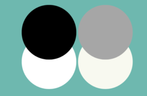
A light and a dark colour together such as black and white, will create a high level of contrast between the two shades.

Whereas if you ‘dull’ the shades down slightly making them off-white and grey, the contrast will be less severe and less harsh. There will be less contrast between the light and dark shade.

Some people are better suited to having more contrast, others not quite so much.

Your fabric choice can also affect the colour too. Choose something shiny like satin and it will brighten the appearance of the colour because it reflects the light.

Fifty shades of grey

For someone who feels afraid of colour, or that they’ll stand out too much, a colour analysis may feel daunting. It’s worth noting that there isn’t just one shade of neutral either. Fifty shades of grey there may be, but have you ever tried to get the same shade of navy, camel or white??

Within everyone’s palette is a range of neutral and a range of colours. By understanding the fundamentals of how colour is made up and how this refers and impacts on your own characteristics, you can use this understanding to make better buying decisions.

The consultation and swatches

A basic colour analysis assess your core, or dominant colouring type and you’ll take away 30 shades of colour most suited to you based upon your core features.

However, this is refined even further during the Complete Colour Analysis consultation. Your sub-dominant colouring types are analysed (your secondary and tertiary types) which takes you to 48 shades in your swatches. The range of colours included will have different elements and features which harmonise with you and who you are.

Yes, there may be brighter shades than others but ultimately, it’s all about how you wear them. That’s what you’ll learn during your colour analysis consultation.

My services are an investment in yourself after all.

Book your colour analysis consultation today!

toni.carver@tlcstyleandcolour.co.uk

Spring colours – how to wear yellow

I’ve been talking about colour and style trends lately as April is the month I introduce my seasonal updates. You can find more details here. Invariably, yellow always comes up as a discussion point.

Usually in spring, we see more yellow in the shops – perhaps because the sunshine and better weather is on the way.

I’m often asked how to pick the right shade of yellow and to wear it successfully which is the subject of this blog.

Different shades

If you haven’t had a colour analysis consultation then it can be much harder to get this right. You might have very little colour in your wardrobe or find it difficult to identify if a colour suits you or not. Try and experiment with different colours to identify the shades of colour that appear to light up your face (making you look brighter), and those that appear to dull or cast shadows onto your features (making you look tired or unwell).

When you’ve had your colouring type analysed, this task is much easier for you! You know your best shades of colour and you’ve got your own coloured swatches to refer to. These are a helpful guide when shopping but, bear in mind that fashion houses will create different dyes and mixtures. You may have even created your own colour if you regularly dye your own clothes! (visit this blog for my own colour experiment).

There’s never just one shade of a colour. Think of yellows and I’m sure you can think of two or three different shades; daffodil yellow, sunshine yellow and ice-cream vanilla immediately spring to my mind. Not every shade of yellow will look great on you. Just like every shade of blue, red or purple will.

If you’ve read this blog about colour analysis, I refer to an artist called Alfred Munsell. His system of colour categories helps to identify and describe colours and that there is more to colour than just, well, the colour.

Think about how you’d describe your features and how you describe colours. What are the words you use? This can help you focus on finding and identifying the right colour or combination of colours to wear.

For each core colouring type I’ve detailed some brief guidelines on choosing and wearing the shade of yellow which will compliment you the best.

Colouring types and combinations

how to wear yellowLights: Keep your look light and delicate wearing with similar light and pale shades. Think light primrose or buttermilk and wear with taupe. Try and avoid overpowering colours and high contrasting combinations. If you have a warm undertone then you may find yellow easier to wear.
Deeps: Your look is strong so make sure you add depth with your yellow such as a daffodil or ochre. Wear with a richer shade like navy to create some contrast and depth.

Warms: You suit many shades of yellow and will be one of the easiest colours to wear. Think mustard or primrose and wear with olive.

Cools: This won’t be a natural or easy choice as yellow undertones aren’t as flattering for you. Opt for an icy yellow with an element of coolness and wear with contrasting shades like grey. You may find it easier to wear away from the face so it’s not directly reflecting up onto your features.

Clears: You’ll always look your best in bright, vibrant colours so think canary yellow and team with strong, contrasting shades like red.

Softs: As your look is more softened, the same can be said of your colours. A yellow which looks like it has been faded by the sun will work even though it’s not in your swatches. Wear your colours tonally with similar mid-tone depth of shades like pewter. And, if you find it tricky, wear it away from your face.

I have previously recorded videos on how to wear colour including yellow. You can visit it here.

Knowing your colours

Understanding how certain colours and combinations make you look tired, pale or unwell whilst others make you look vibrant, healthy and younger can take time to establish. It’s often tweaking to a different shade of colour to suit you better.

When you have ‘your colours done’, you’ll gain a greater understanding and how to wear colour. By gaining this knowledge, it will help you to build a colourful, coordinated wardrobe which can be mixed and matched easily.

It really is life-changing so if you would like to book an appointment, get in touch with me: Toni.carver@tlcstyleandcolour.co.uk or schedule a call with me using the link at the bottom of the page.

Nine ways to add colour to your wardrobe

Wearing colour is so easy!

So, in this video, I’m going to show you how easy it is to add colour to what you wear.

I’ll show you nine simple ways that you can try out for yourself.

Which one will you try and wear??

Watch it here.

  1. Choose a top or a dress (in one of your best shades of course)
  2. Choose a pair of shoes or some boots
  3. Wear jewellery such as a necklace or even earrings
  4. How about a corsage or a colourful brooch (you could even wear it in your hair)
  5. Choose a handbag
  6. A colourful pair of gloves
  7. Wear a lipstick or lip gloss (in your best shade of course)
  8. Choose a scarf
  9. How about a hat?!

Three ways to choose and combine colours using your swatches

One of the questions I get asked a lot is how to wear your colours when you’ve had a colour consultation. With so many colour options in your swatches, it can feel overwhelming. Whilst we go through this in your colour session, it’s easy to forget. Sometimes it’s nice to have some inspiration too!

There are many combinations you can choose but much depends upon your own individual style and look you want to achieve as well.

In this video, I’m sharing three ways that you can use your swatches to help you choose and combine your colours together. Whether you have 30, 42 or 48 swatch wallet, I’m sharing different methods of using the colours in your swatches.

The demonstration uses my own clothes and swatches to help explain the methods.

Take a look and watch it here.

Colour challenge: three ways to wear colour

If you’re feeling a bit fed up then fear not! Let me take this opportunity to boost your mood with my simple colour tips. Consider it a dose of some TLC!

Wearing colour has such a profound impact. Not just upon how you look (eg. brighter, younger, tired, youthful) but also how you feel and your mood. Trust me; it really can help to boost your mood and those around you too.

Maybe you had your ‘colours done’ (aka had a colour analysis consultation) in the past. Perhaps you have absolutely no idea what I’m banging on about. Or, are you up for experimenting with something new? Whatever your reasons, why not get involved and give these a try?

I’ve put together three simple ways and methods of introducing colour or adding colour in what you wear.

My only rule (well it’s not really a ‘rule’, just advice I give all the time: choose a shade of colour that you know makes you feel good on the inside. (I’m all for looking good on the outside, but it’s that feeling good bit I recommend you focus on).

If you prefer to watch my video on Youtube, click here.

1. Colour Pop

Colours by Ell sneakers This is the easiest way to start experimenting with colour. So, if you’re either not used to wearing colour at all, or you fancy trying something new then this one is for you.
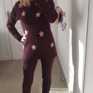
Think of this more as adding a splash of colour to your outfit.

Choose just one colour to wear on it’s own as a method of injecting some colour to your outfit.

Most importantly, it could be anything! Perhaps a top, a bag, shoes, socks, earrings, a hat or even a scarf. Any colour you like as you’re simply going for a ‘pop’!

Here I am wearing a pair of Sneakers from Colours by Ell who stock a range of shoes and colours available to suit your colouring type.


2. Column of colour

Colour columnYour next challenge is wearing just one colour this time from top to toe. It could be a top and trousers or a skirt.


You don’t need to be too matchy-matchy with your chosen colour here (unless you’re a classic or city chic personality type). Tonal shades will work just as well together as does wearing one colour.

Interestingly, this is also a great way to dress if you’re on the petite side or if you wish to appear slimmer. A column of colour adds vital inches to a small frame and can make you appear visually leaner.

In this example it’s a simple jumper and jeans combo both in damson.


3. Colour drench

Depending upon your style personality type; this may feel rather daring!

With this colour challenge, everything you wear will be in the same colour – including your accessories. You’re drenching yourself in colour!

A great way to make this feel less daunting is to mix up your textures and fabrics. If you’ve not had a style and shape consultation, make sure the fabric you choose highlights your good bits. Adding chunky knits and bulk with layers upon layers of clothes will just add pounds to your frame. Should you carry weight around your tummy or bust for example (or you don’t want to showcase them), avoid bulk and texture in the area.

Here I have two examples for you. One in purple and one blue where textures and fabrics and shades of colour are slightly different.


That’s your three ways to wear colour!

It’s my favourite way to dress: in colour. Colour makes you FEEL GOOD and that’s why I like to wear it! My colour and style sessions are available as part of a programme as well as individual sessions both online and in person. If you’re ready to book, get in touch and I’ll help you on your journey!

Colour me beautiful 2021 colours of the year

Delighted to bring to you two new colour me beautiful Colours of the Year for 2021.

If you’re looking for some colour inspiration and longing for spring time garden shades, here’s two colour me beautiful shades which are very wearable and will instantly update your wardrobe. Both feature in the new colour collections.

Orchid

Orchid

This is a cool pink shade therefore those of you who have a cool undertone can wear it with confidence. If your secondary or sub type is cool then here’s a few tips on how to wear this new colour. Should you have a warmer undertone then scroll down to Olive Grove.

Lights

This is a lovely shade that will complement your colouring perfectly. Wear on its own or try mixing with a lighter colour from your palette, such as Icy Pink.

Deeps

Add a deeper shade from your palette such as Dark Teal to balance out your strong look.

Clears

You will find that you need to add a stronger colour to Orchid due to your look. Try wearing it with Plum.

Softs

Wear tonally to complement your blended look. Jade works as a nice combination.

Cools

If you’re a Cool dominant colouring type, you can enjoy wearing this colour on its own. Also try to create new looks by combining it with deeper shades in your palette.

Olive Grove

Olive grove

This is a warm green that anyone with a warm undertone or secondary sub dominant can wear successfully. If you have a cool undertone, scroll up to see Orchid.

Lights

Keep your look delicate by combining it with Buttermilk.

Deeps

Wear with a strong shade such as Mahogany to balance out your look.

Clears

Add contrast to Olive Grove with a lovely Zingy Lemon shade.

Softs

Try and wear it tonally to complement your blended look such as with Peach.

Warms

Those of you as a warm core colouring type, you can of course enjoy wearing this colour on its own, but create new looks by combining with your other warm shades.

Orchid and Olive Grove are part of 12 new colours introduced by colour me beautiful in the latter part of 2020. There are six new colours to compliment your colouring type and can be added to your current fabric swatches on a new colour card.

To obtain your six extra fabric swatch card and a guide to how to wear and combine them with neutrals in your palette, click here for warm and click here for cool.

Colour assessment workshop – 23 January 2021

Join this workshop to discover how to wear colour in your clothes and makeup with confidence and to enhance your overall look!

The session will take place virtually from the comfort of your own home so you’ll need a laptop, smart phone or tablet to be able to join the session.

You will learn:

– The benefits of knowing what colours suit you the most
– How to wear colour to make you look younger and healthier
– Simple tips to make colour work for you
– What your core colour type is

A colour card and list of makeup shades are included which will be posted out to you following the session.

You’ll be required to supply some photographs ahead of the session for individual assessment.

Everyone can wear colour, it’s simply about finding the right shades.

Buy your tickets here.

Client showcase – how to wear colour

I can’t tell you how many times I’ve heard people tell me ‘they have nothing to wear’!

Of course, most people, especially women, feel like this. And it’s also not always because they have no clothes; it’s more the fact that they don’t feel like they have the right clothes for them.

We‘ve all felt a little lost in what to wear this year. Colour is the easiest and simplest way to boost your mood and feel good, but choose the wrong shade for you, and it can have the opposite effect.

Recently, I asked some of my clients if they’d be willing to send me a picture of them looking and feeling fabulous wearing their best colours so I could create a video. Using real women and real people to help me demonstrate how positive and uplifting colour can be and how amazing you can look and feel when you know what suits you.

This video showcases just some of my clients who agreed to take part and I’m very grateful that they agreed.

Don’t they look fabulous?

Click here to watch

How to wear colour video series

Welcome to a series of videos on how to wear colour!

It is so easy to wear colour. Not only can it transform your overall look but it really can boost your mood too! Not knowing or understanding how to wear colour is something that many people tell me they struggle with. Sometimes you can’t put your finger on why something does or doesn’t suit you.

As an image consultant, my colour consultations are by far my most popular session. These are available Online; from the comfort of your own home for when we can’t meet in person as well as in person at the studio in Wakefield, West Yorkshire.

If you don’t know what colours to choose, or how to wear them, then these videos give you some tips on how to do so and also why it can make such a difference.

Check them out here and if you have any questions, do get in touch.

How to wear yellow
How to wear purple
How to wear blue
How to wear green
How to wear red
How to wear pink
How to wear neutrals 
How to wear black

How to wear colour to boost your mood

Colour has been found to have a profound impact on our mood, as well as how we look.
For me, colour is the easiest way to update your image. It doesn’t require lots of money or time, just a little understanding. It’s also one of the most rewarding and favourite elements of my job as an image consultant.
This feels like a good time to share some tips on wearing colour so that you can feel good in spite of what’s actually going on.

Your appearance

You make a visual statement about how you view yourself in what you wear. It reinforces your self image as when you know you look good, it’s this confidence that shines through. When you don’t feel quite so good about yourself, this can be evidenced in exactly the same way.
At the current time of writing, there’s a global pandemic as a result of the Coronavirus and many people are either working from home or isolating themselves.
Just because you’re sat at home and not seeing anyone, it doesn’t mean that you can’t feel good in what you wear. Plus, thanks to technology, many people are having virtual meetings and as good as your PJs are, what impression does that give to your boss, colleague, business connection or client?
Be honest. When you sit there in your comfies, as lovely as you feel, it doesn’t exactly heighten your mood does it? I love comfy, but I just ensure that my loungewear are in colours which suit me so that I can look good as well as feel good!

Colour

The human eye requires balance and harmony. With your appearance, this is achieved between your physical features and what you wear.
When you wear the right shades of colour, they will flatter, enhance and brighten your appearance. Choosing the wrong shades of colour will cast shadows and age you and nobody wants that!
There’s only so many colours which exist – everyone can wear colour it’s simply identifying which shades work best for you and your physical characteristics.
Here’s a few popular colours and psychologically, the impact on not just yourself, but others too.

Red

Psychologically, wearing red gives an air of confidence and being in control. Red is the colour of energy so it’s a great colour to wear if you feel like you need some energy to approach your day. Perhaps even a bit of red lippy 💋
Be careful though as it is also the most assertive, aggressive and attention grabbing of colours. Think of the colour of the stop light at the traffic lights.
Getting the undertone right when wearing red is crucial as if you’re cooler with no warmth in your hair or skin tone then you’ll need a blue based red. If you have these warmer tones, then you’ll be much better suited to a yellow based red.

Blue

Seen as safe, peaceful and logical and it’s known to convey trustworthiness as our law and order officials have navy blue uniforms. Equally blues can be seen as cold, unemotional and unfriendly so they may not make the best impression with a new client.

Green

The colour of nature and is worn by the armed forces for camouflage purposes. It’s also seen as a calm and reassuring colour and wearing it can also demonstrate creativity and imagination so why not give it a whirl?

Black

Have you ever found that you just feel a bit down when you wear black? A mood-hooverer and who needs that right now?!
Whilst you may find it easy and safe to wear, it’s not the most suitable for everyone. I often find that people wear it as they aren’t sure what else to wear. They lack the imagination, time or know how and get trapped in black!
It’s a rather authoritative colour and appears not very approachable too, so in a business sense, could this be to your detriment?
If you find that this isn’t the most complimentary colour to wear, try introducing a coloured shirt, blouse, top or scarf.

White

The one colour which truly reflects light making it the ideal colour to wear in hot climates. Given that the majority of travel is currently at a standstill, perhaps best staying in the wardrobe for now?
This purity makes it hard to wear for most people though as in its purist form, it’s too harsh. Wearing an off white is usually more flattering.
It is clean and hygienic too!

Pink

Often seen as a feminine colour though it can suggest empathy, gentleness and compassion. Guys who wear pink demonstrate that they are comfortable with their masculinity. Something which could be really helpful in the current climate.

Purple

As a colour, it can indicate sensitivity and be spiritual. Some people have found it helps in meditation and can promote a sense of relaxation which I’m sure is something we would welcome.

Confidence

I often find that many people have lost confidence in what to wear or just don’t know what suits them which isn’t great for our self esteem. If you do find yourself with a bit of time on your hands, you might be tempted to do a bit of shopping from the comfort of your own home. If you already feel like you’ve got nothing to wear, shopping without any guidance or direction is likely to mean that you’ll end up with the same type of clothes that you’ve already got, or that they don’t work with other items you have in your wardrobe. You might also feel that they don’t suit you, or that you don’t feel like ‘you’ in them.
Don’t despair. This time will pass. But, try not to be tempted to buy what’s fashionable or simply because it’s there. Learn what what works for you and why, then all these bad purchases will be just that. Plus, they will no longer languish in the back of your wardrobe with the tags still on! You can finally stop wasting money on things you never wear!

The 2019 Pantone Colour of the Year is…

2019 is nearly here!

Pantone, like every year have announced what their colour of the year is for 2019.

In 2018 it was ultra violet. It was one of my faves as I love purple and find it such a versatile colour to wear. There are lots of different shades of purple out there too meaning there’s a shade out there for everyone.

When the Pantone Color Institute make their annual announcements, designers around the globe take note and we see trends emerge in the shops. It’s not always restricted to clothing or fashion, but household appliances too have been known to follow the trend!

Announcing Colour of the Year – 2019

Living Coral!

Pantone say it’s “an animating and life affirming Coral hue with a golden undertone that energises and enlivens with a softer edge. Sociable and spirited, the engaging nature of Living Coral welcomes and encourages lighthearted activity. Symbolising our innate need for optimism and joyful pursuits, Living a Coral embodies our desire for playful expression”.

We wear colour as a way of expressing ourselves – in our clothes and makeup. Wearing colour makes you feel good, look good (when wearing the right shade) and also boosts our confidence.

If you’ve been for a colour consultation and had your colours done in the past, then choose to wear the most flattering orange shades from your palette – use your colour swatch wallet to guide you.

Should you fall into our Warm category and warmer versions of the Light or Clear colouring types, you’ll be delighted!

Unfortunately, Coral won’t be in your palette for the rest of you, but if you do want to be ‘on trend’, then how about a new kitchen appliance?!

Makeup

Here’s my recommendations from our cruelty free, paraben free cosmetic range available in the studio or via my online shop.

Eyes

Peach – available as a single eyeshadow pot or as a refillable for our magnetic compact. Suitable for everyone except Cools – go for your pinky shades such ballerina pink, cotton candy, champagne or opal.

Lips

The obvious choice is our Coral Lipstick suitable for you Lights, Warms and Clears.

If you’re a Deep, why not try the Sheer rum or Sheer nutmeg lipstick as an alternative?

For you Cools, give Strawberry lipstick a try and for you Softs, Spiced Peach or Sheer breeze would be ideal.

Our Mango Lip Gloss is the perfect shade to co-ordinate with this ‘on-trend’ colour too which is great for you Lights, Deeps, Warms and Clears. If you’re a soft try Warm Sand lipgloss and for you Cools, it’s back to the pinks and avoid the trend all together I’m afraid as it’s just not for you!

If you would like to know the shades of colour which suit you best, why not book a consultation here.