Every year, Pantone announces its Color of the Year, setting the tone for fashion and design trends worldwide. In this blog post, I’ll show you how to incorporate this colour into your outfits, no matter your personal style or tonal palette.
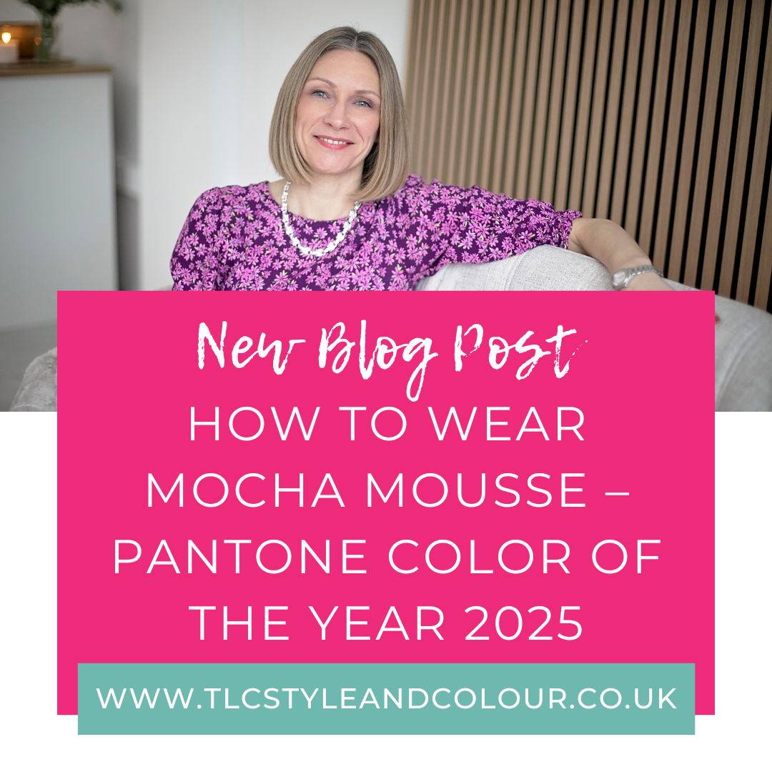
Introducing the ‘Color of the Year’ 2025: Mocha Mousse
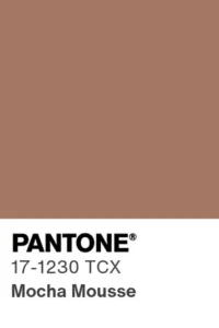
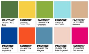
Image c/o Pantone
For 2025, the Pantone Color Institute chose PANTONE 17-1230 Mocha Mousse.
According to Pantone:
PANTONE 17-1230 Mocha Mousse is a warming, brown hue imbued with richness. It nurtures us with its suggestion of the delectable qualities of chocolate and coffee, answering our desire for comfort.
Essentially, it’s a light brown, neutral shade which I can see will be loved by some. It’s got more of a warmer hue to it and will tick the box of timeless, ‘quiet luxury’ and ‘country chic’ trends and wardrobe staples.
Visit the Pantone website to read more about this year’s Color of the Year.
How to Wear Mocha Mousse
Being a neutral tone, it’s more versatile than last year’s color of the year (Peach Fuzz).
If you love it, the good news is that you’ll find lots of similar shades in the shops already, as featured in my autumn/winter colour trend guide (available here). It’s worth remembering that you don’t have to match the colour exactly, simply tweak it slightly and opt for a shade that flatters you the most. Think chocolates and coffee tones. You could also wear it away from your face so the impact is less severe against your features and won’t cast a shadow.
For those who know what their colouring type is, you’ll find it most similar to cocoa in your colour me beautiful fabric swatches.
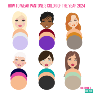
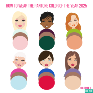 Here’s some colour combinations to inspire you further with your outfits.
Lights: Keep it light and delicate, try it with mint, or dusty rose.
Deeps: Opt for dark and strong combinations such as aubergine or forest green.
Warms: Wear with apricot, or lime green.
Cools: Due to it’s warmer hue, you’ll need to cool it down. Try hot pink or sky blue.
Clears: Go for bright or contrasting, such as royal blue or scarlet red.
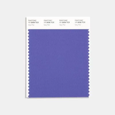
Softs: keep it muted and blended, such as soft violet or natural beige.
It can be a great colour choice for staple items such as coats and jackets, or a pair of trousers or a skirt too.
Makeup
Of course, you don’t just have to wear it in your clothes! This is a great shade for nails and cosmetics. Here’s my pick from the Colour me Beautiful cosmetic shades to inspire you further.
The cocoa eyeshadow refill for the magnetic compact is the most obvious choice. Use it as an accent or colour in the contour of your eye and would be great for lights, warms and softs. If you’ve got some depth or brightness to your eyes, you could opt for mocha which is a darker shade. For the cool toned, try steel instead. If you prefer a more intense colour, opt for damson or espresso in the intense eyeshadow refill colours.
Browse the full range here, which you can filter down to your colouring type. If you need any assistance choosing shades, get in touch. Remember, you can try before you buy from the studio in Wakefield, West Yorkshire.
In the home instead!
I think interior designers will love this colour! So, if you’re not up for wearing it, adding this colour hue to your home would make a lovely relaxing tone. A gorgeous throw or rug, paint a feature wall or opt for a new electronic device instead!
Now you know more about the Pantone Colour of the Year, it’s time to experiment!
For tailored advice on how to make it work for you, book a colour analysis consultation. You’ll gain the confidence to choose your best shades and transform your wardrobe in 2025.