If you fancy being brave and fearless with your colour choices this year, then look no further than Pantone’s Color of the Year: Viva Magenta!
It’s been over 20 years that Pantone have been doing this research. What started as a way of engaging the design community it now influences and engages many industries. From fashion, home furnishings to design and packaging!
Introducing the Color of the year – 2023
Each year I share details about the new colour (color) and how to incorporate it.
According to Pantone:
Viva Magenta 18-750, vibrates with vim and vigor. It is a shade rooted in nature descending from the red family and expressive of a new signal of strength. Viva Magenta is brave and fearless, a pulsating color whose exuberance promotes a joyous and optimistic celebration, writing a new narrative.
The Meaning Behind Viva Magenta
For this year, Pantone comment that people are incorporating more nature into our homes like plants, florals, living walls, and restorative outdoor spaces which is no surprise given the pandemic.
You may be surprised to learn that the colour itself originates from the cochineal beetle which produces a red carmine dye. It’s reportedly one of the most precious, strongest, and brightest of the natural dye family.
How to Wear Viva Magenta
Like most colours, it’s all about finding the right shade for you and wearing it in a way that works for you. As it’s rather bold, you can go all in and wear as a statement colour. Or, why not introduce it with accessories such as a belt, scarf or shoes. It would be just fabulous combined with your neutrals like grey, navy and brown.
During a colour analysis consultation, I’ll talk you through all your shades of colour but I always spend a little time doing a red ‘test’ because there are so many shades of red out there it helps if you can identify the type of red shades which suit you best.
Pantone claim that Viva Magenta strikes a balance between warm and cool. To me, it looks easier to wear it if you’re cooler. If you are warmer, then you’ll need to search out a shade with less blue.
I’ve put some colour combinations together to inspire you to wear it below by selecting some colours from the core dominant colouring type palettes. If you’ve had a full colour analysis and you know your secondary and tertiary shades, you can simply combine one or two of these instead.
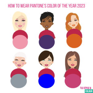
Lights – it has quite a bit of depth to it so wear with one of your lighter tones like dusty rose
Deeps – it’s a great tone so wear with one of your richer tones like royal purple
Warms – if it’s a blue base, you’ll need to try and wear it away from your face and warm it up so try it with terracotta
Cools – the more blue based the better for you! Try it with light or medium grey
Clears – it’s quite a bright colour on it’s own anyway so try it with one of your Chinese blue
Softs – it may be somewhat on the bright side but it will tone perfectly with many pinks and reds so try it with orchid from your palette.
Makeup
Viva Magenta would be fabulous on lips, cheeks and nails.
Here’s some Colour me Beautiful shades I’ve picked out as more obvious and closest choices:
Cerise or Sheer Fuchsia lipstick
Rose or Cantaloupe lip pencil
Rose berry eyeshadow refill (for the magnetic compact) would be a great pop of colour for the eyes!
Browse the full range here and there’s up to 40% off until 10 January. If you need help with any makeup, then do get in touch.
In the home and around
If you prefer to add your colour flares to your home decor, keep your eye out for a fabulous velvet couch or new paint for a feature wall.