How to wear Peach Fuzz – Pantone color of the year 2024

Let’s start the new year with a bit of colour, shall we??

At the start of every year, I share some advice on Pantone’s ‘Color of the Year’ (they’re not a UK company). Now in the 25th year, the Pantone Color of the Year is now a globally recognised programme. It influences and engages many communities and industries. it’s a colour you’re likely to see throughout the year.

Introducing the ‘Color of the Year’ 2024: Peach Fuzz

One that seems to have divided opinion thus far!

According to Pantone:

PANTONE 13-1023 Peach Fuzz captures our desire to nurture ourselves and others. It’s a velvety gentle peach tone whose all-embracing spirit enriches mind, body, and soul.

In seeking a hue that echoes our innate yearning for closeness and connection, we chose a color radiant with warmth and modern elegance. A shade that resonates with compassion, offers a tactile embrace, and effortlessly bridges the youthful with the timeless.

The Meaning Behind Peach Fuzz

For this year, Pantone felt a need for a more peaceful future. Taking care of ourselves, reevaluating what is important to us, like our family and friends. Looking for that warm and welcoming embrace to lift us into the future.

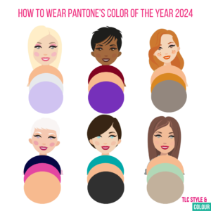
How to Wear Peach Fuzz

How can you incorporate it into your wardrobe?

It’s much less bold compared to last year’s Viva Magenta. Some will find it much more inviting and I can certainly see it in furry textures and velvet or suede. I’m also thinking that it’s much more wearable in makeup, from eyeshadow to nail polish, which could be a great option if it’s not your best hue.

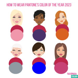
During a colour analysis consultation, I’ll talk you through and show you the shades of colour which compliment you the most. With this particular shade, it will suit ‘warm’ dominant colouring types the best. Softs and lights will likely find it easier to introduce to their wardrobe, if they haven’t already.

If you’re not sure if it’s the right colour for you, it’s worth checking the impact it’s having against your features. I’ve written about this previously here.

For those who know what their colouring type is, I’ve put together some colour combinations to inspire you to further. I’ve chosen one neutral shade and another colour alongside peach fuzz, depending how daring you want to be. If you’ve had a full colour analysis and you know your secondary and tertiary shades (you’ll have 36, 42 or 48 swatches in your wallet), just combine one or two of these instead.

Lights: This is a flattering shade on you! Try mixing it with your lighter and deeper colours in your swatches. Try with light grey or lavender.
Deeps: Peach Fuzz will wash you out unless you combine it with a stronger colour. I’ve paired it with burgundy and violet.
Warms: This is your season! You’ll be able to wear it with so many tones in your palette. How about with golden brown or amber and pewter?
Cools: This will not be your best look. But, if you love the shade, who am I to tell you not to wear it! Try drenching it with one of your fabulous shades, try it in a print or as accessories. I’ve chosen navy and hot pink for you.
Clears: It isn’t strong enough a shade for you to wear by itself and your skin will look lifeless and pale. Give it some oomph by combining it with a strong, bold shade. I chose emerald turquoise and charcoal as your neutral.
Softs: Peach Fuzz is a wonderful soft shade for you to add to your wardrobe, especially if you have a warm undertone to your skin. Wear it tonally with shades of a similar depth. I’ve featured cocoa and verbena.

Consider wearing it as a scarf or accessory or as a pattern if you’d rather not wear it as a block colour. The fine wool, three-colour scarf is available to purchase from the studio which work suit you if you’re a ‘warm’ dominant or a soft & warm colour type.

Makeup

Peach Fuzz is a fabulous shade for lips, cheeks and nails and do remember it has a warmer hue to it.

I’ve picked out some Colour me Beautiful cosmetic shades to inspire you further:

Eyes – the peach eyeshadow refill is an obvious choice which can be worn by everyone. Use it as an all over base or as a blender. Melon would be a great alternative if you find peach to be too warm for you.

Cheeks – peachy tones are always better suited to you if you have some warmth to your skin. Salmon and Muscat will work well, but opt for more pinky tones if you’re cooler like marsala.

Lips – spiced peach, coral, warm pink are the obvious choices for those with an element of ‘warm’ in their palette. Chiffon would be a better choice for everyone else, or simply avoid the peach fuzz tones of course!

Browse the full range here. If you need help with any makeup, then do get in touch. You can try before you buy in the studio.

In the home and around

Peach Fuzz not one for you this year? Keep your eye out for a fabulous velvet couch, paint a feature wall or opt for a new electric device instead!


How to wear Viva Magenta – Pantone color of the year 2023

If you fancy being brave and fearless with your colour choices this year, then look no further than Pantone’s Color of the Year: Viva Magenta!

It’s been over 20 years that Pantone have been doing this research. What started as a way of engaging the design community it now influences and engages many industries. From fashion, home furnishings to design and packaging!

Introducing the Color of the year – 2023

Each year I share details about the new colour (color) and how to incorporate it.

According to Pantone:

Viva Magenta 18-750, vibrates with vim and vigor. It is a shade rooted in nature descending from the red family and expressive of a new signal of strength. Viva Magenta is brave and fearless, a pulsating color whose exuberance promotes a joyous and optimistic celebration, writing a new narrative.

The Meaning Behind Viva Magenta

For this year, Pantone comment that people are incorporating more nature into our homes like plants, florals, living walls, and restorative outdoor spaces which is no surprise given the pandemic.

You may be surprised to learn that the colour itself originates from the cochineal beetle which produces a red carmine dye. It’s reportedly one of the most precious, strongest, and brightest of the natural dye family.

How to Wear Viva Magenta

Like most colours, it’s all about finding the right shade for you and wearing it in a way that works for you. As it’s rather bold, you can go all in and wear as a statement colour. Or, why not introduce it with accessories such as a belt, scarf or shoes. It would be just fabulous combined with your neutrals like grey, navy and brown.

During a colour analysis consultation, I’ll talk you through all your shades of colour but I always spend a little time doing a red ‘test’ because there are so many shades of red out there it helps if you can identify the type of red shades which suit you best.

Pantone claim that Viva Magenta strikes a balance between warm and cool. To me, it looks easier to wear it if you’re cooler. If you are warmer, then you’ll need to search out a shade with less blue.

I’ve put some colour combinations together to inspire you to wear it below by selecting some colours from the core dominant colouring type palettes. If you’ve had a full colour analysis and you know your secondary and tertiary shades, you can simply combine one or two of these instead.

Pantone colour of the year 2023

Lights – it has quite a bit of depth to it so wear with one of your lighter tones like dusty rose
Deeps – it’s a great tone so wear with one of your richer tones like royal purple
Warms – if it’s a blue base, you’ll need to try and wear it away from your face and warm it up so try it with terracotta
Cools – the more blue based the better for you! Try it with light or medium grey
Clears – it’s quite a bright colour on it’s own anyway so try it with one of your Chinese blue
Softs – it may be somewhat on the bright side but it will tone perfectly with many pinks and reds so try it with orchid from your palette.

Makeup

Viva Magenta would be fabulous on lips, cheeks and nails.

Here’s some Colour me Beautiful shades I’ve picked out as more obvious and closest choices:

Cerise or Sheer Fuchsia lipstick

Rose or Cantaloupe lip pencil

Rose berry eyeshadow refill (for the magnetic compact) would be a great pop of colour for the eyes!

Browse the full range here and there’s up to 40% off until 10 January. If you need help with any makeup, then do get in touch.

In the home and around

If you prefer to add your colour flares to your home decor, keep your eye out for a fabulous velvet couch or new paint for a feature wall.

Pantone colour of the year 2022

Announcing the new color of the year for 2022!

If you’re a regular follower of TLC Style & Colour on social media, then you’ll have seen the news of Pantone’s color of the year already.

Pantone have been doing this for over 20 years. They take many influences into account from across the globe and why does it matter? Well, the result is that their chosen shade of colour is reflected in products that you’ll be more likely to buy – from fashion to home furnishings.

2022

Last year there were two colours (read it here) and for 2022 there is just one colour (color) shade.

Introducing…..Very Peri

Pantone describe it as: “Displaying a carefree confidence and a daring curiosity that animates our creative spirit, inquisitive and intriguing PANTONE 17-3938 Very Peri helps us to embrace this altered landscape of possibilities, opening us up to a new vision as we rewrite our lives. Rekindling gratitude for some of the qualities that blue represents complemented by a new perspective that resonates today, PANTONE 17-3938 Very Peri places the future ahead in a new light.”

Who does it suit?


Well, it’s a shade of purple after all which is a universal colour to suit everyone! This particular hue (think blue and purple mix) should be easy to incorporate into your wardrobe – I’m certainly looking forward to it!

Use Very Peri to add an injection of colour into your neutrals (think scarves, tops and accessories). You can go deeper or lighter to suit your own colouring too.

If you’ve got a wedding coming up, bridesmaids and mother of the bride or groom will look wonderful in shades of periwinkle. Choose a shade to suit their individual colouring and if it looks too harsh, consider the fabric and neckline or book a colour session with me!

Another tip is to think about the colour group if you’re struggling with the specific shade. Whilst it’s a fabulous bold shade for some, it may feel too bold for others. Try and combine it with other shades of purple – think amethyst, mauve, violet and lavender shades.

For you Cools, Clears and Deeps, it’ll look amazing due to the characteristics of the colour. It’s most similar to your bright periwinkle swatch. Warms, Lights and Softs will want to take it down a notch to the Light Periwinkle shade for it to compliment you the most.

Colour combos

Lights – try light periwinkle with light grey, pewter or dusty rose. An alternative shade to try would be violet.

Deeps – wear it with blush pink or aubergine.

Warms – try your light periwinkle with purple or primrose.

Cools – wear it with sky blue, charcoal or cassis.

Clears – try it alongside soft white, lemon yellow or light apricot.

Soft – wear it with damson, soft violet or sapphire.

Makeup

If you fancy experimenting a little with your makeup shades for 2022, look out for a new nail polish or gel?

You could also try and introduce a new eyeshadow shade!

The Colour me Beautiful ‘Delph’ eyeshadow refill (for the magnetic compact) is rather similar and for something with more of a punch there is also the ‘purple’ eyeshadow refill which suits everyone for that little bit of colour pop.


For help finding clothes or makeup to suit you, get in touch and I’ll be happy to help.

All makeup is available to order from the studio or get 10% off online orders. Be quick as it ends on 31 December!