How to Use Your Colour Swatches (In-Store and Online)

Ever held your colour swatches up to a garment in a shop and thought, “Hmm… is this right?” Add online shopping into the mix, and it can feel even trickier. Shopping with your colour swatches does make shopping easier, but fabric, lighting, and screen colours can still throw up a few surprises.

With a few simple techniques, your swatches can become your most powerful wardrobe tool.

(Prefer a visual guide? I made a video showing exactly how to use your swatches — it’s still relevant today and you can watch it here.)

Why Your Swatches Matter

Your swatches guide you to the colours that brighten your skin, make your eyes pop, and lift your whole look — for clothes, makeup, and accessories.

When you’ve had a colour analysis consultation with me, you receive a personalised fabric swatch wallet. Each swatch represents a tone that harmonises with your natural features — your hair, eyes, and skin tone. Each colour has its own characteristics, much like you, so that when both have the same characteristics, they’ll harmonise with you much better. You can wear them alone or mix them to build a wardrobe that feels effortless and cohesive.

Tonal colour analysis is based on the Munsell system, which describes colours by hue, depth, and clarity. Unlike seasonal systems that vary worldwide (spring in the UK isn’t the same as spring in Japan), tonal swatches work consistently anywhere – which is why I offer tonal colour analysis consultations.

Think of your swatches as a tool — not a set of rules to follow.

Using Your Swatches In-Store

Shop lighting and fabric types can make colour tricky to judge. Here’s how to use your swatches effectively:

– Compare side by side: Hold the swatch next to the garment to compare tones.
– Focus on harmony, not exact match: Look for undertone (warm vs cool), depth (light, mid, dark), and clarity (soft/muted vs bright/vibrant).
– Check fabric differences: Cotton swatches may appear differently than wool, satin, or polyester.

Pro tip: The more you practice, the faster you’ll recognise your tones instinctively.

Using Your Swatches Online

Screens, filters, and photo edits can distort colours. Here’s how to shop online confidently:

– Check multiple product images — lighting may vary.
– Read product descriptions carefully — “warm beige” or “cool stone” tells you more than just “beige.”
– Compare the garment to your swatch — focus on tone, depth, and clarity, not the fabric match.
– Look at the model’s colouring for context, if available.

Pro Tip: Stick to trusted retailers who accurately represent colour and remember that neutrals can anchor your wardrobe.

Bringing It All Together

Your swatches aren’t just pretty cards — they’re a working tool to help you shop smarter and feel confident with your choices.

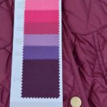
Here’s an example:

The colour of this jacket is almost the same as ‘claret’ on my ‘soft’ dominant swatch card. It’s not an identical ‘match’ to the cotton swatch, because the jacket is a different fabric.

Find more details about my colour analysis consultations here: https://www.tlcstyleandcolour.co.uk/services/colour-analysis-consultations/

Come with a friend or combine your session with a wardrobe audit, or a style and shape consultation too.

If you know your colouring type, swatches are also available to purchase online here.

Want help creating a wardrobe that works for you?

WIll you tell me to wear bright colours?

Firstly, it’s not for me to tell you what to wear! I’m not your mother and you’ve made a decision to come for advice. My aim is to arm you with the right information so that you can put it into practice when you leave your session with me.

What many people don’t realise is how many shades of colours there are. Just because it’s a colour, doesn’t mean it has to be bright.

The features of a colour

All colours have features to them and during a colour analysis consultation, I’ll explain more about colour theory and the Munsell System which I use in my colour consultations.

Colours which compliment your features and characteristics will naturally brighten your overall look. You’ll look healthier and your eyes will brighten. Dark shadows, discolouration or those that wash you out aren’t complimenting your features and don’t bring out the best of you. In simple terms, this is the impact of a colour against your features and it can be good, or not quite so good.

The combinations of colours together can also change the impact and appearance of the colour.

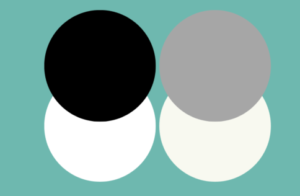
Take this example.

A light and a dark colour together such as black and white, will create a high level of contrast between the two shades.

Whereas if you ‘dull’ the shades down slightly making them off-white and grey, the contrast will be less severe and less harsh. There will be less contrast between the light and dark shade.

Some people are better suited to having more contrast, others not quite so much.

Your fabric choice can also affect the colour too. Choose something shiny like satin and it will brighten the appearance of the colour because it reflects the light.

Fifty shades of grey

For someone who feels afraid of colour, or that they’ll stand out too much, a colour analysis may feel daunting. It’s worth noting that there isn’t just one shade of neutral either. Fifty shades of grey there may be, but have you ever tried to get the same shade of navy, camel or white??

Within everyone’s palette is a range of neutral and a range of colours. By understanding the fundamentals of how colour is made up and how this refers and impacts on your own characteristics, you can use this understanding to make better buying decisions.

The consultation and swatches

A basic colour analysis assess your core, or dominant colouring type and you’ll take away 30 shades of colour most suited to you based upon your core features.

However, this is refined even further during the Complete Colour Analysis consultation. Your sub-dominant colouring types are analysed (your secondary and tertiary types) which takes you to 48 shades in your swatches. The range of colours included will have different elements and features which harmonise with you and who you are.

Yes, there may be brighter shades than others but ultimately, it’s all about how you wear them. That’s what you’ll learn during your colour analysis consultation.

My services are an investment in yourself after all.

Book your colour analysis consultation today!

toni.carver@tlcstyleandcolour.co.uk

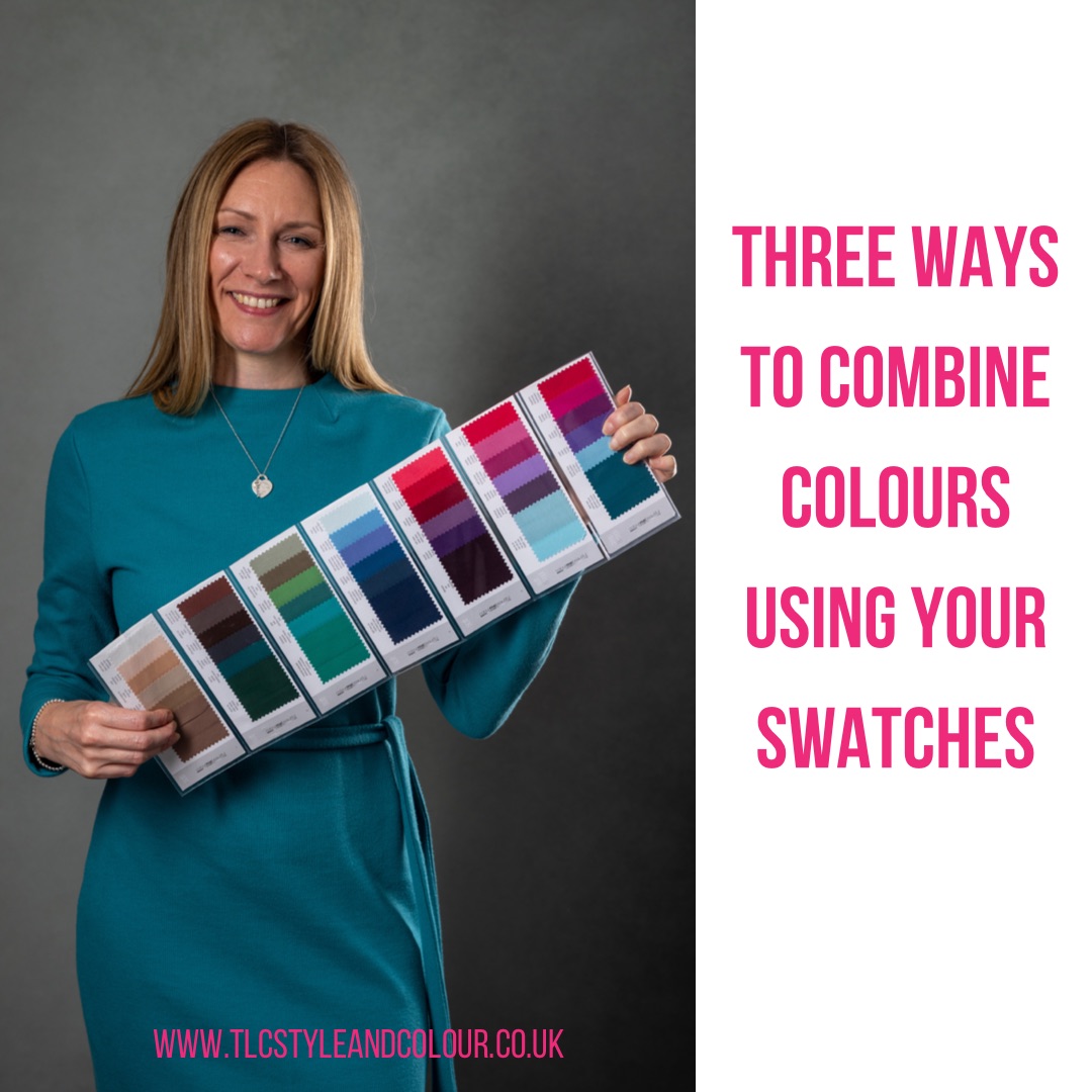
Three ways to choose and combine colours using your swatches

One of the questions I get asked a lot is how to wear your colours when you’ve had a colour consultation. With so many colour options in your swatches, it can feel overwhelming. Whilst we go through this in your colour session, it’s easy to forget. Sometimes it’s nice to have some inspiration too!

There are many combinations you can choose but much depends upon your own individual style and look you want to achieve as well.

In this video, I’m sharing three ways that you can use your swatches to help you choose and combine your colours together. Whether you have 30, 42 or 48 swatch wallet, I’m sharing different methods of using the colours in your swatches.

The demonstration uses my own clothes and swatches to help explain the methods.

Take a look and watch it here.