

Ever held your colour swatches up to a garment in a shop and thought, “Hmm… is this right?” Add online shopping into the mix, and it can feel even trickier. Shopping with your colour swatches does make shopping easier, but fabric, lighting, and screen colours can still throw up a few surprises.
With a few simple techniques, your swatches can become your most powerful wardrobe tool.
(Prefer a visual guide? I made a video showing exactly how to use your swatches — it’s still relevant today and you can watch it here.)
Why Your Swatches Matter
Your swatches guide you to the colours that brighten your skin, make your eyes pop, and lift your whole look — for clothes, makeup, and accessories.
When you’ve had a colour analysis consultation with me, you receive a personalised fabric swatch wallet. Each swatch represents a tone that harmonises with your natural features — your hair, eyes, and skin tone. Each colour has its own characteristics, much like you, so that when both have the same characteristics, they’ll harmonise with you much better. You can wear them alone or mix them to build a wardrobe that feels effortless and cohesive.
Tonal colour analysis is based on the Munsell system, which describes colours by hue, depth, and clarity. Unlike seasonal systems that vary worldwide (spring in the UK isn’t the same as spring in Japan), tonal swatches work consistently anywhere – which is why I offer tonal colour analysis consultations.
Think of your swatches as a tool — not a set of rules to follow.
Using Your Swatches In-Store
Shop lighting and fabric types can make colour tricky to judge. Here’s how to use your swatches effectively:
– Compare side by side: Hold the swatch next to the garment to compare tones.
– Focus on harmony, not exact match: Look for undertone (warm vs cool), depth (light, mid, dark), and clarity (soft/muted vs bright/vibrant).
– Check fabric differences: Cotton swatches may appear differently than wool, satin, or polyester.
Pro tip: The more you practice, the faster you’ll recognise your tones instinctively.
Using Your Swatches Online
Screens, filters, and photo edits can distort colours. Here’s how to shop online confidently:
– Check multiple product images — lighting may vary.
– Read product descriptions carefully — “warm beige” or “cool stone” tells you more than just “beige.”
– Compare the garment to your swatch — focus on tone, depth, and clarity, not the fabric match.
– Look at the model’s colouring for context, if available.
Pro Tip: Stick to trusted retailers who accurately represent colour and remember that neutrals can anchor your wardrobe.
Bringing It All Together
Your swatches aren’t just pretty cards — they’re a working tool to help you shop smarter and feel confident with your choices.
Here’s an example:
The colour of this jacket is almost the same as ‘claret’ on my ‘soft’ dominant swatch card. It’s not an identical ‘match’ to the cotton swatch, because the jacket is a different fabric.
-
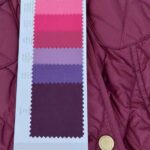
- Match to ‘claret’ in my ‘soft’ dominant swatches
-

- Barbour Jacket
Find more details about my colour analysis consultations here: https://www.tlcstyleandcolour.co.uk/services/colour-analysis-consultations/
Come with a friend or combine your session with a wardrobe audit, or a style and shape consultation too.
If you know your colouring type, swatches are also available to purchase online here.